2290
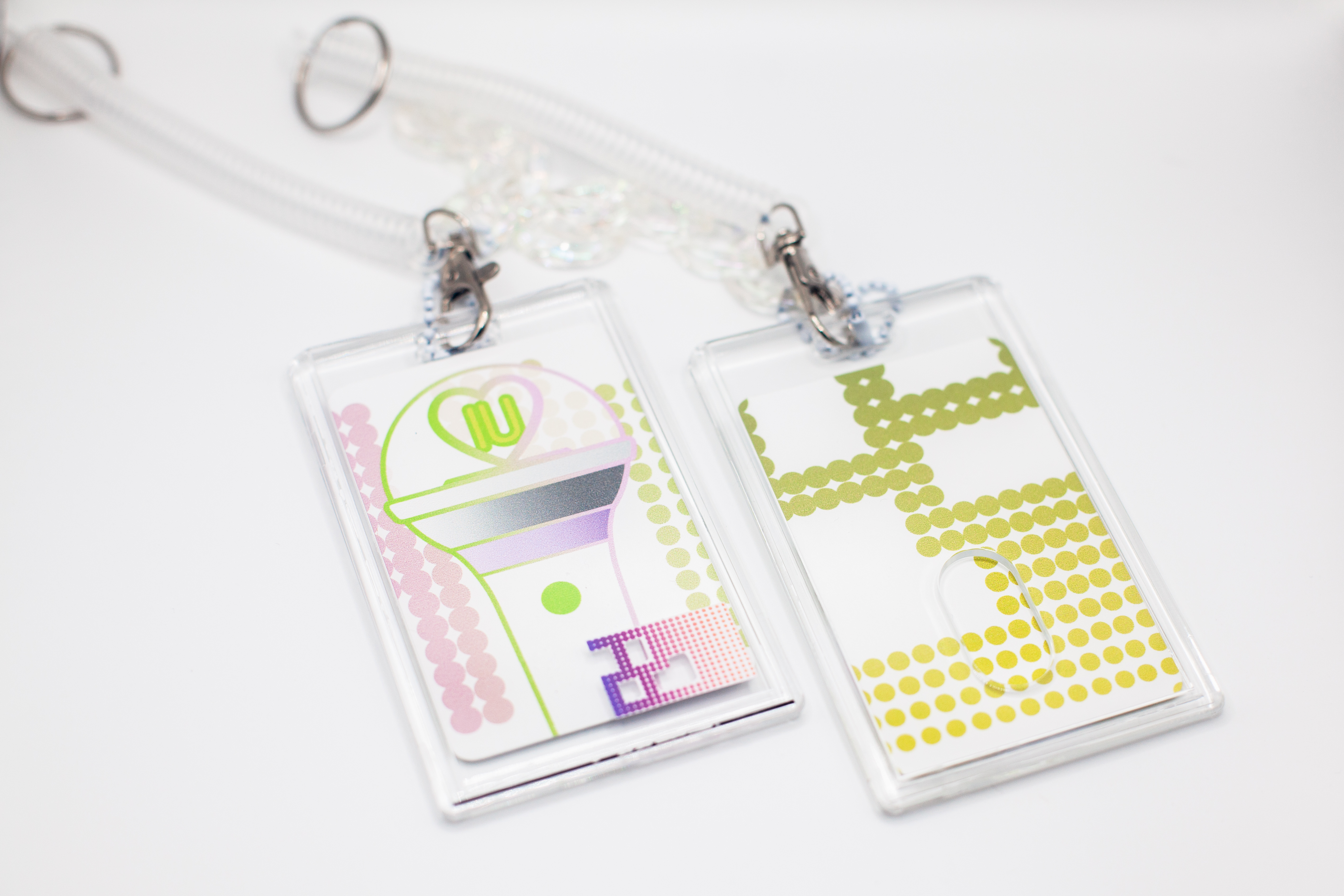
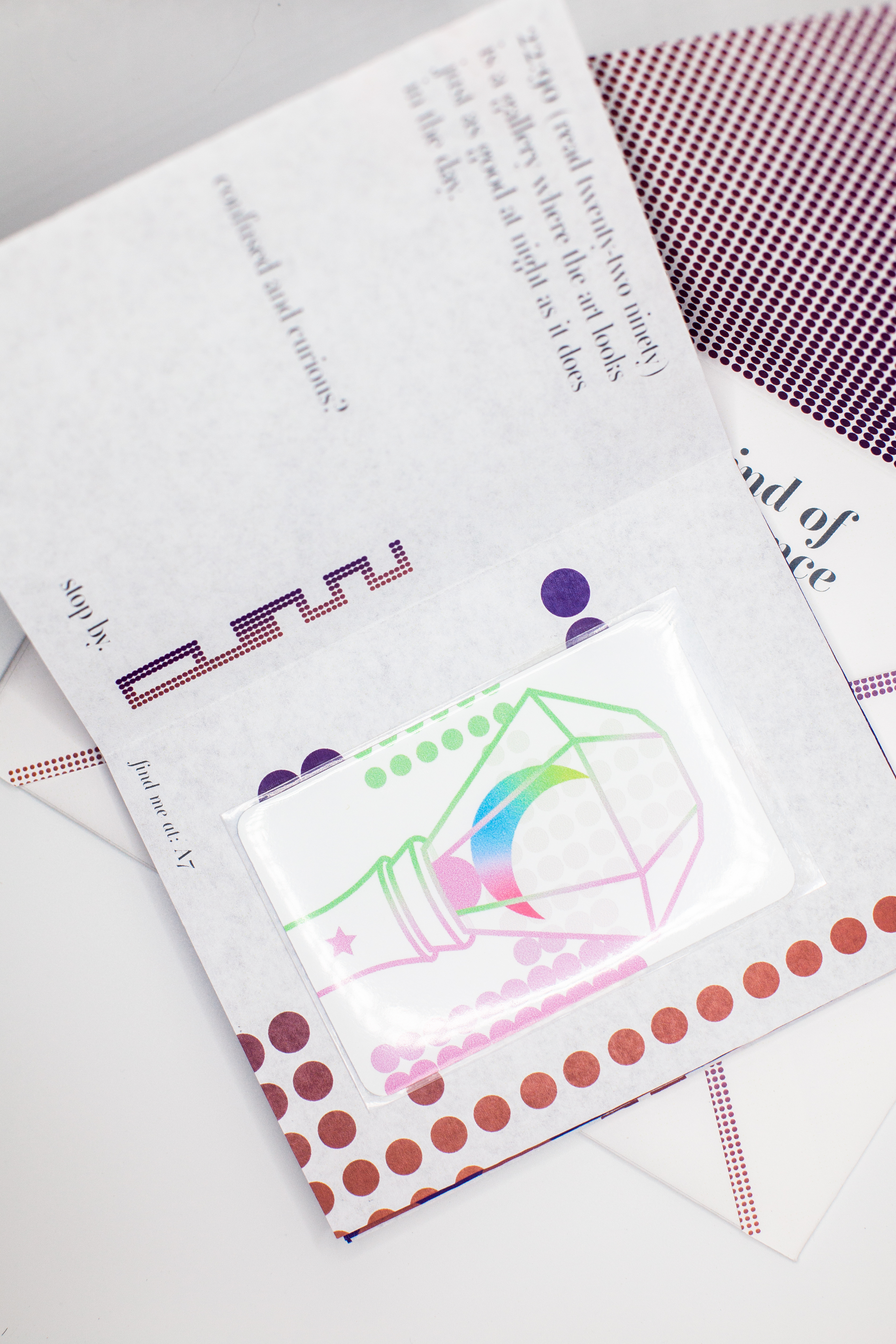
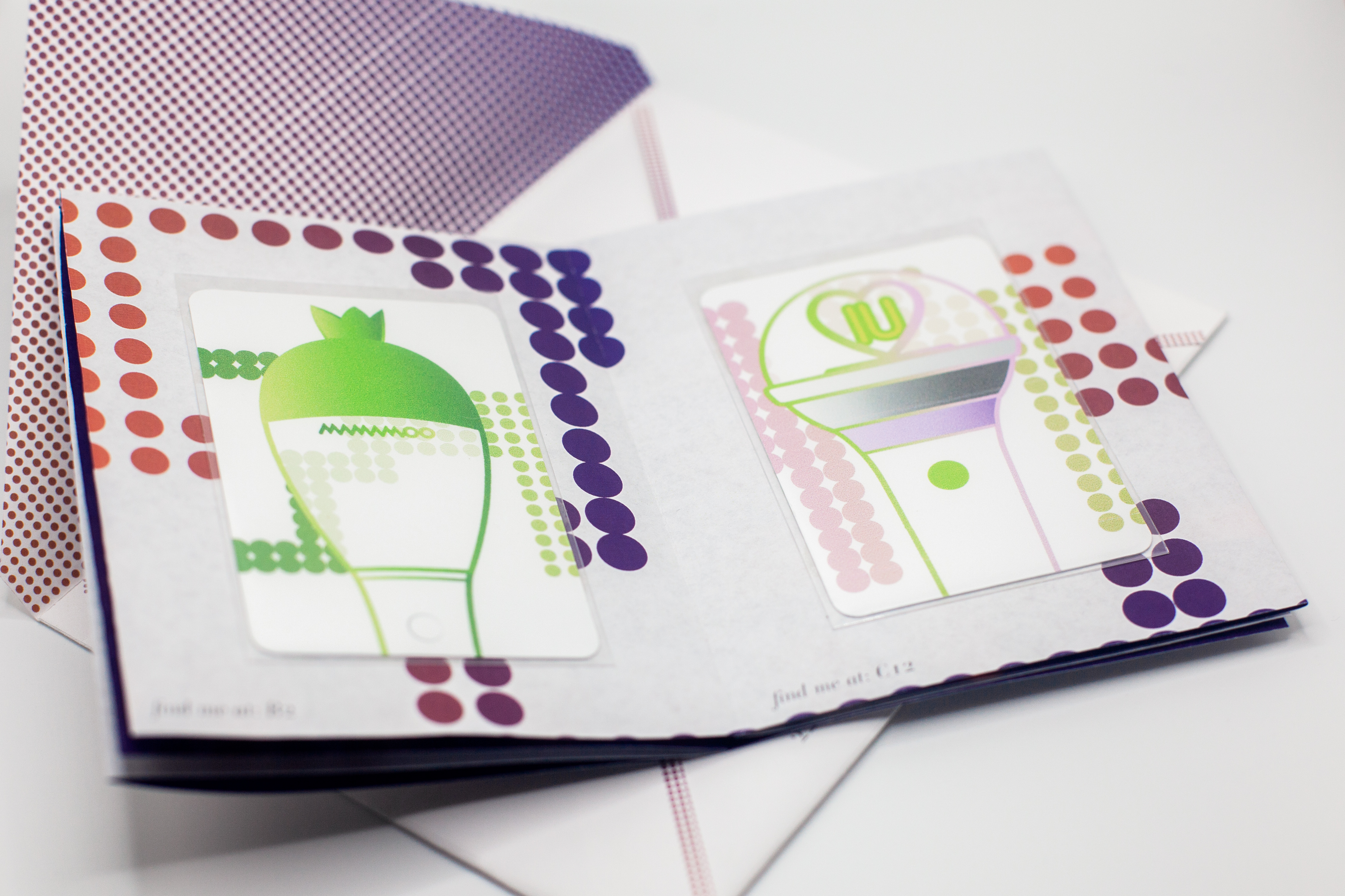
branding identity of a fictional, outdoor gallery that displays the official lightsticks used by fans in the k-pop community to identify themselves with a specific group or solo artist. these lightsticks are commonly seen used at live performances or large fan gatherings. the collectible nature of k-pop merchandise is also highlighted with the inclusion of the exhibition-specific lightstick cards.
branding
identity system
stationary design
publication
motion graphic
poster
package design
branding
identity system
stationary design
publication
motion graphic
poster
package design


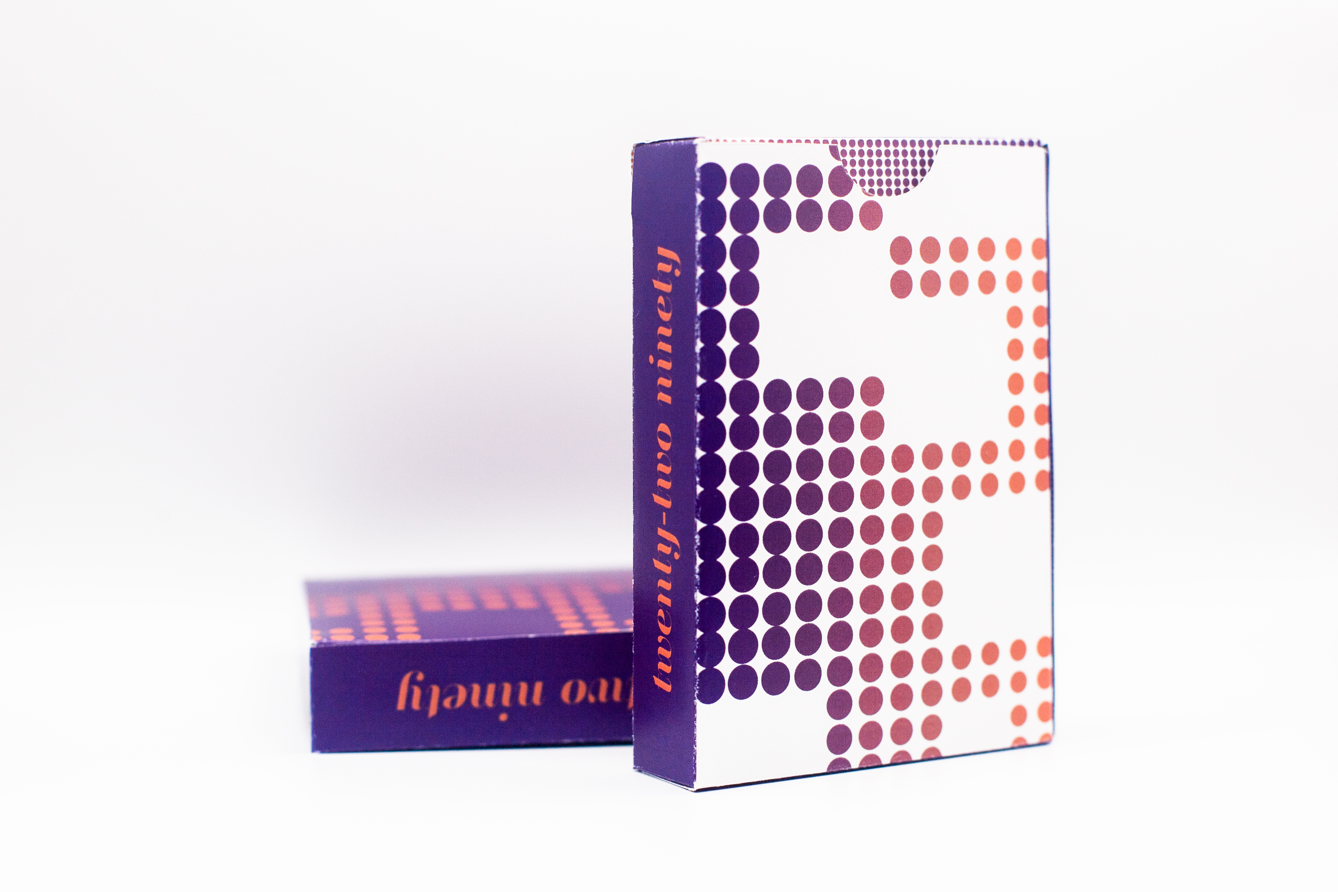
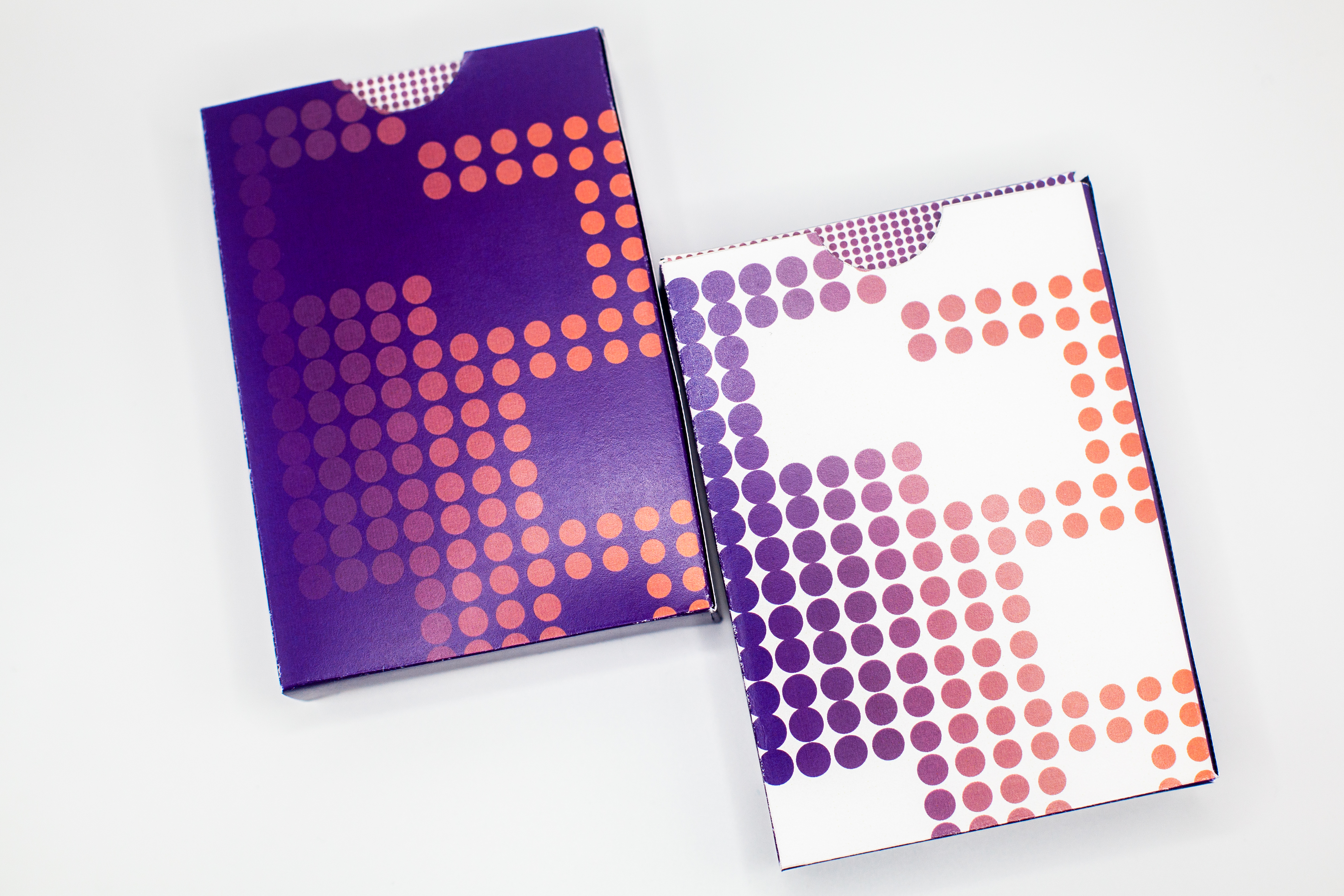
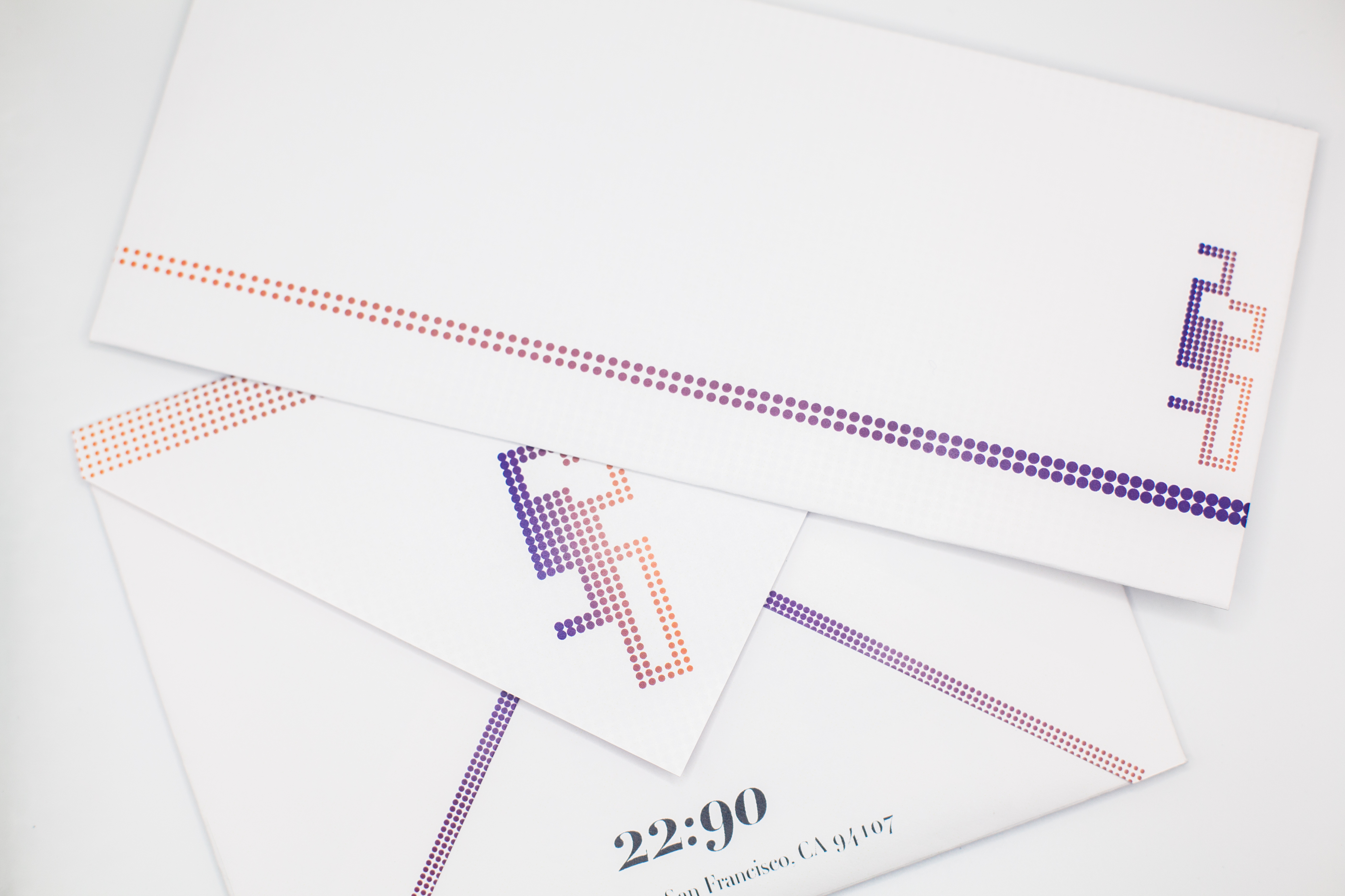
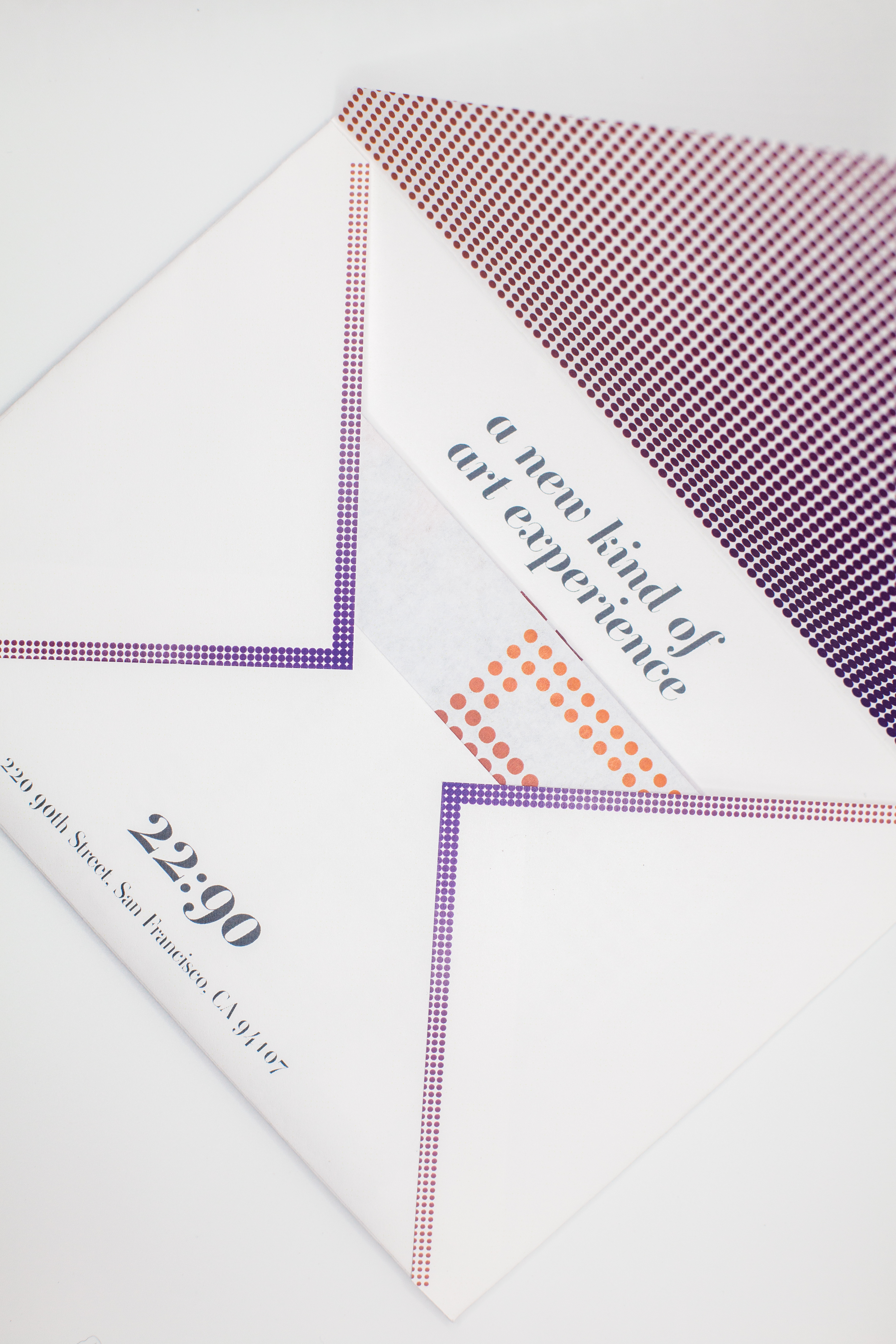
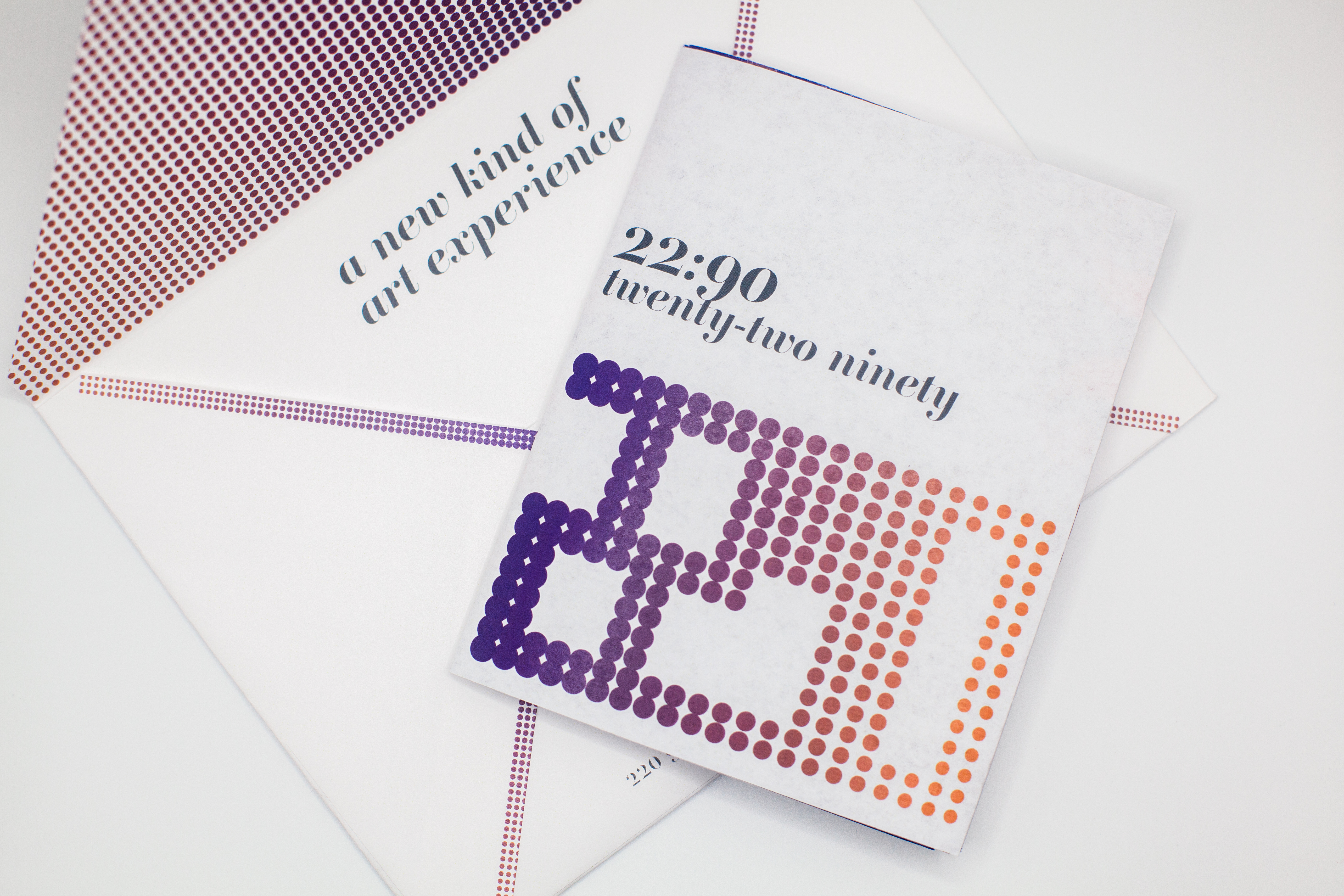
i wanted to keep the branding of the gallery classic but modern while still drawing on inspiration from the location and from the objects i would be displaying. and so the logo took on the form of a modular dot pattern reminiscent of how the lightsticks look when used in a crowd.
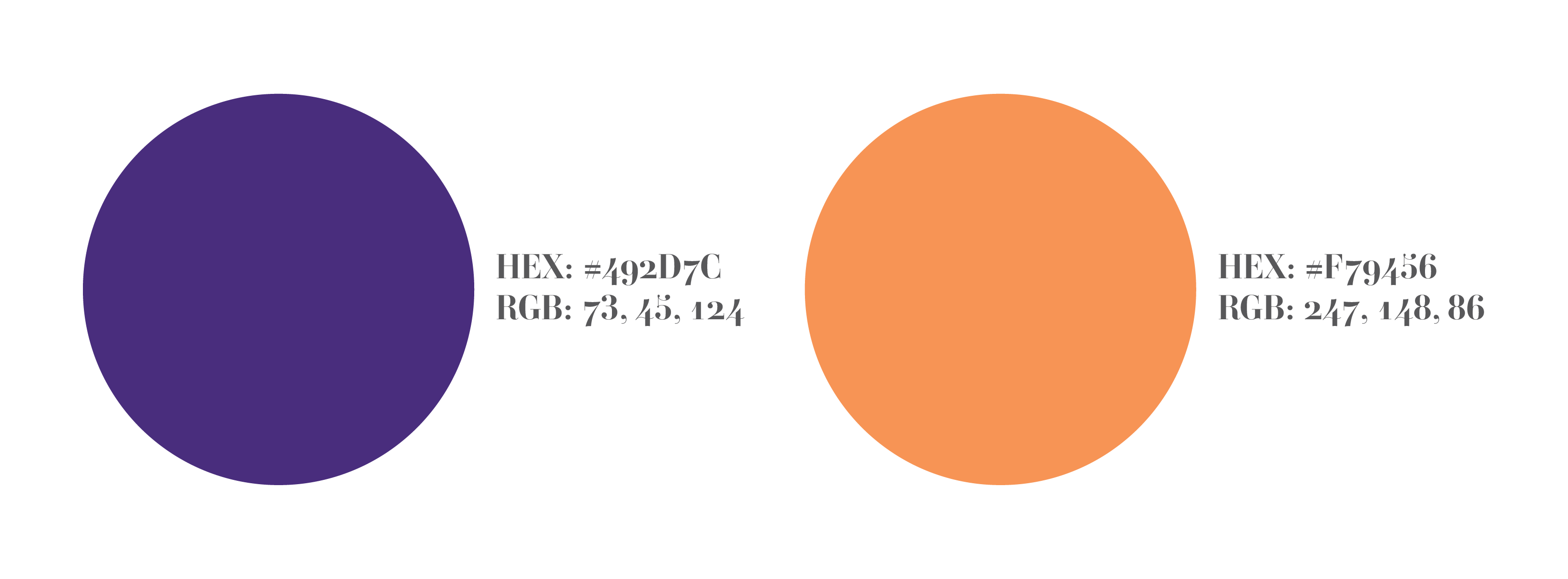
the colors depict a changing of time and a shift from day to night or from light to dark, using colors like purple and orange which are commonly found in the palette of a sunset or sunrise.
for the main typeface, i chose to use ambroise because it’s a contemporary twist on a classic serif, much like the overall branding of the gallery.
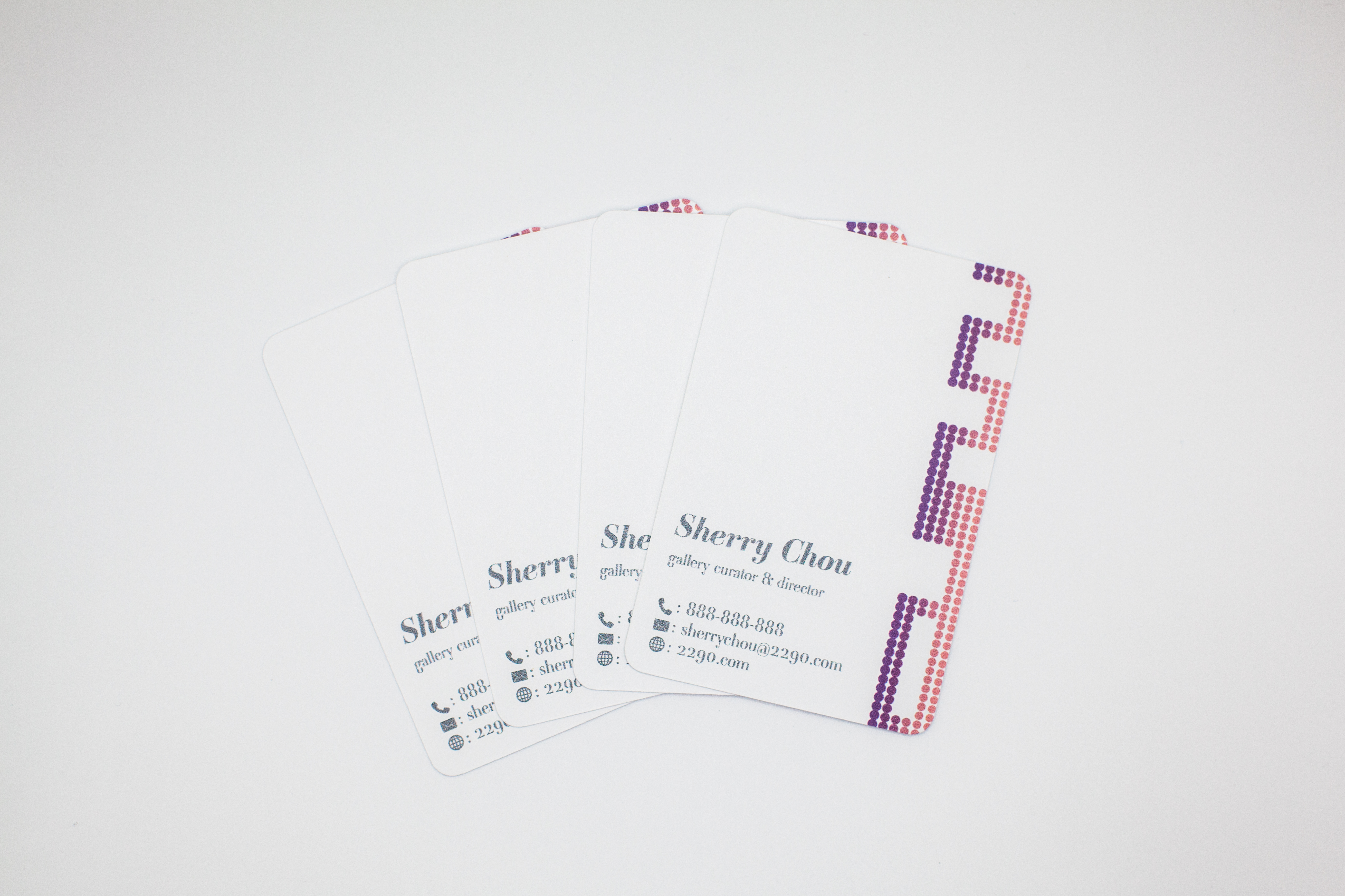
business cards
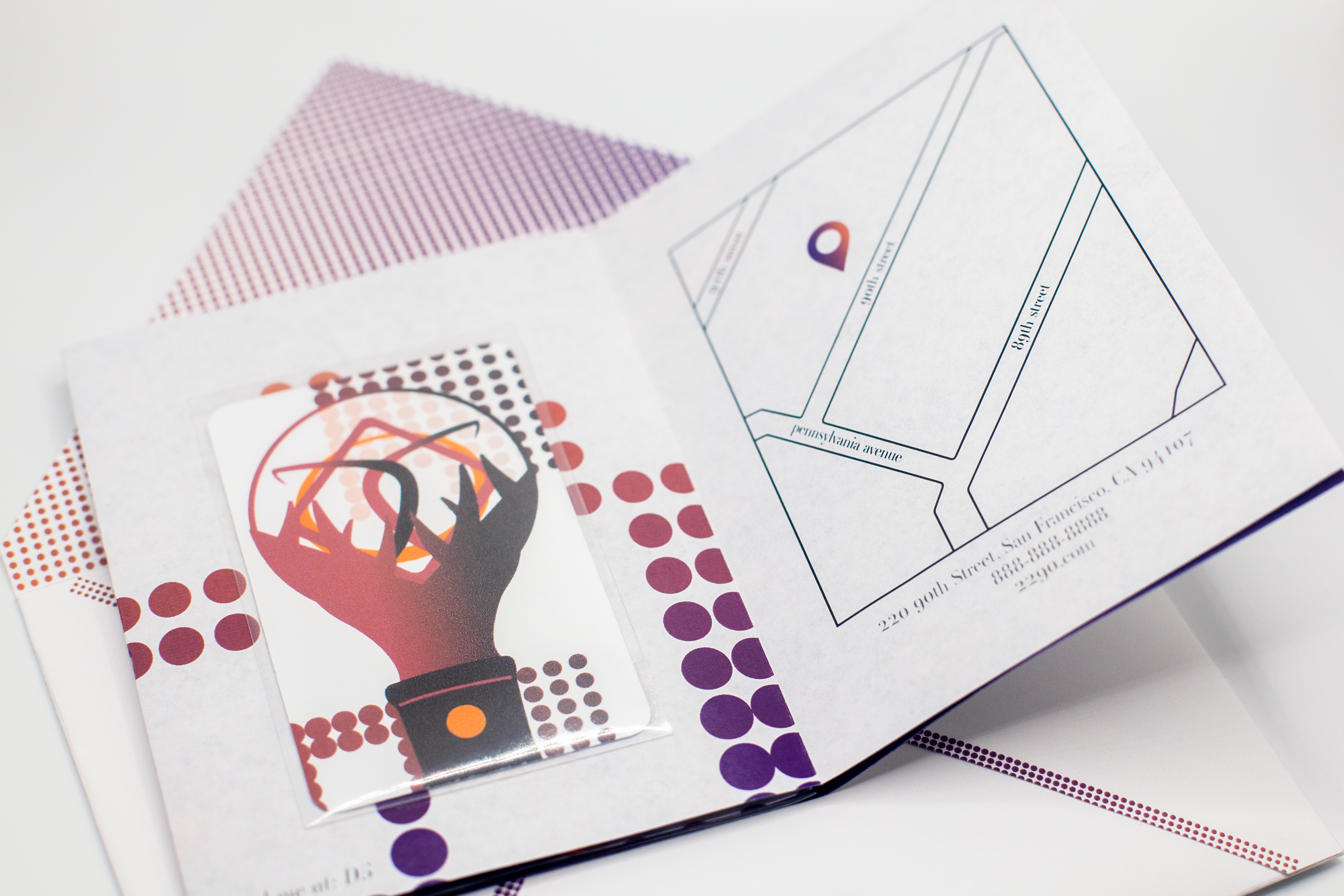
shape inspired by the collectible photocards commonly included in k-pop albums


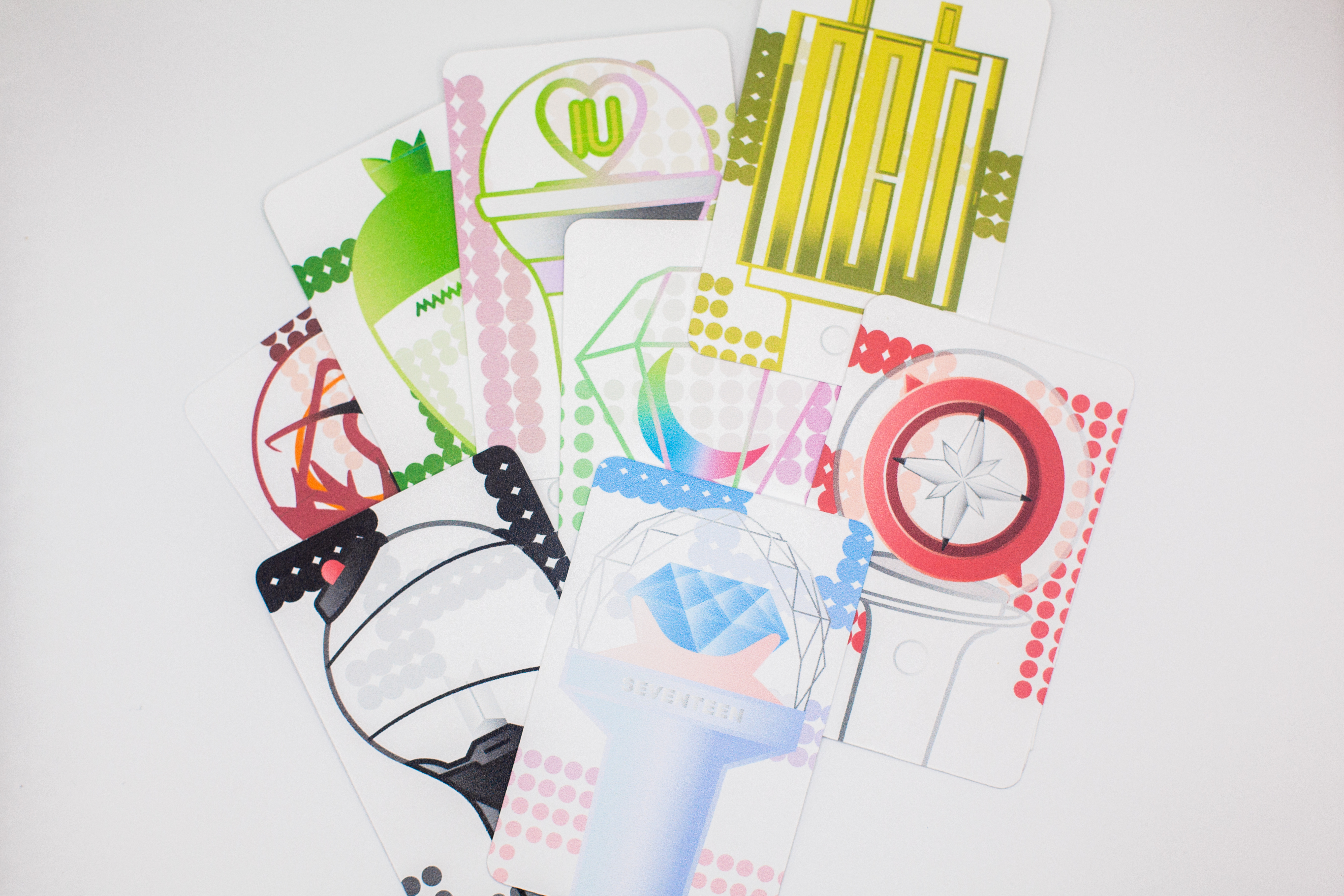
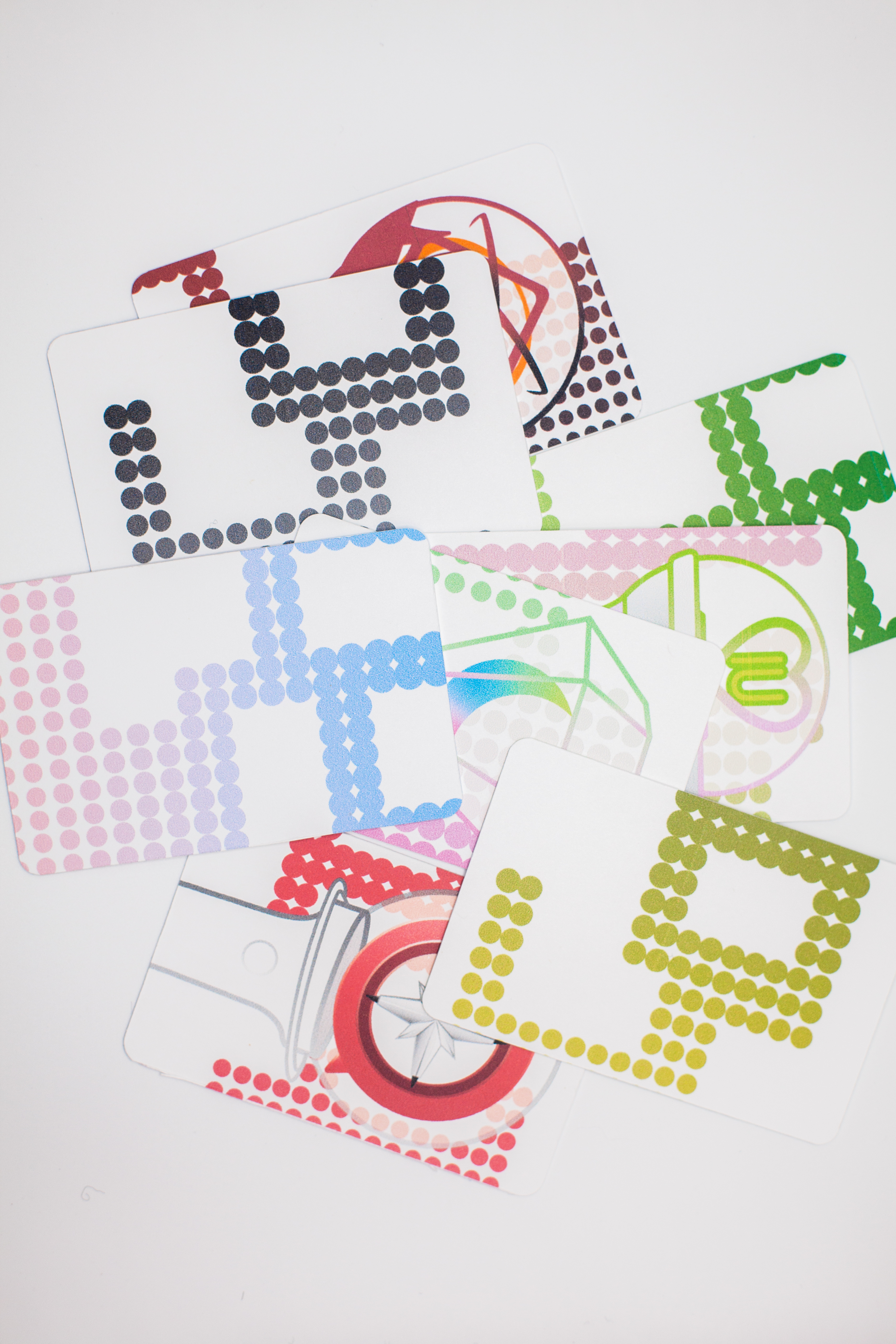
collectible cards featuring the lightsticks on display in the gallery
(inspired by the collectible photocards included in k-pop albums)
stationary
includes business letterhead & envelope

promotional elements
includes double-sided booklet with poster on back, envelope & Instagram video


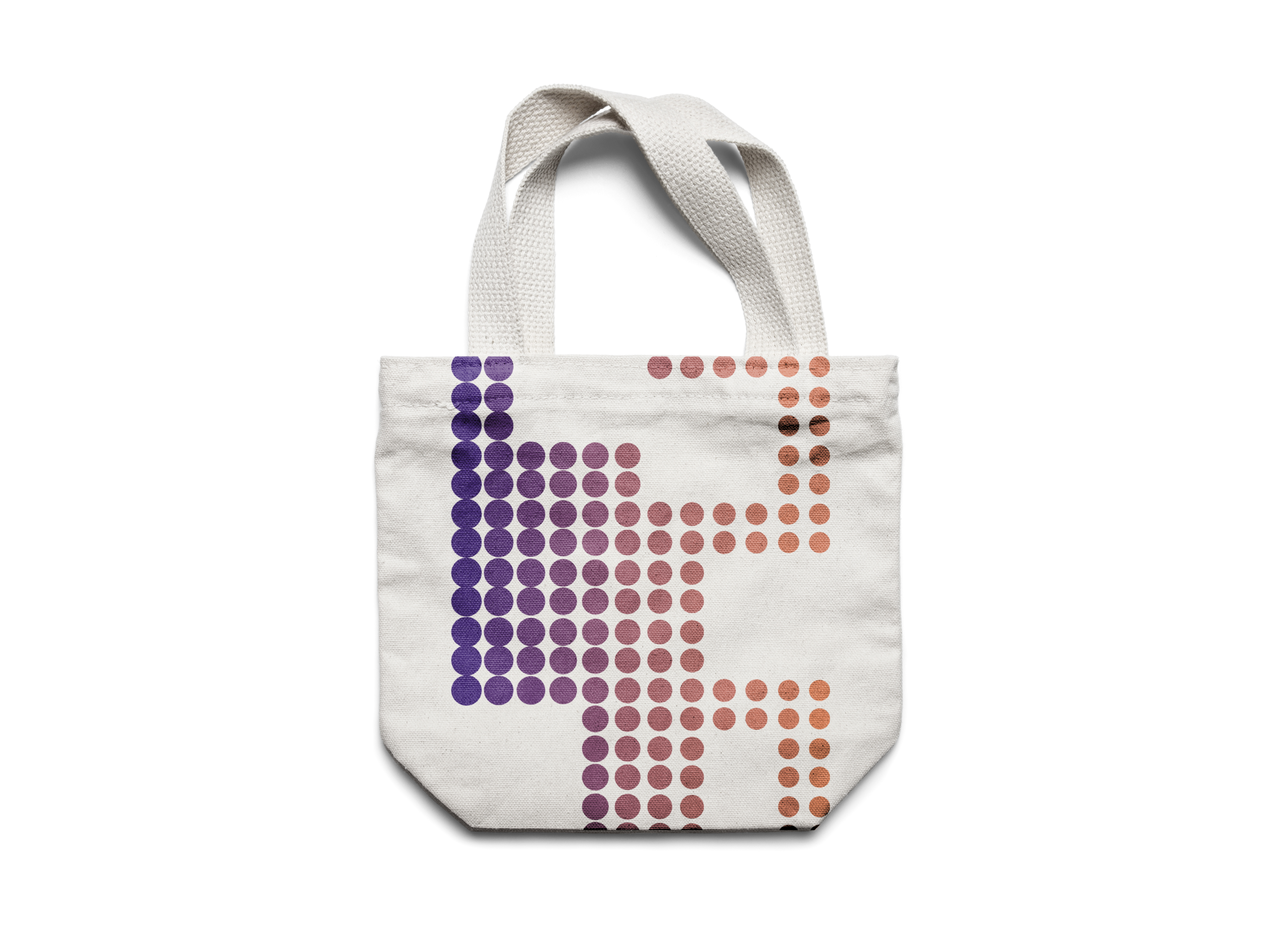
merchandise
includes keychain, card box & tote bag