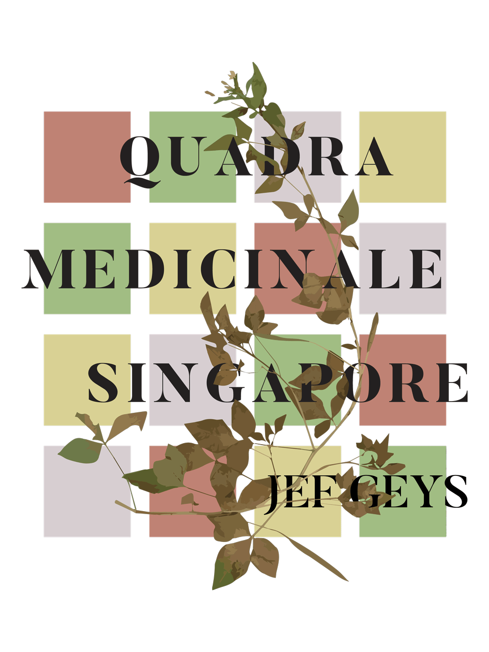
quadra medicinale singapore
assets of an identity system created to promote jef geys’ quadra medicinale exhibition in singapore. the exhibition showcases the medicinal or other productive properties of different unassuming street plants (weeds) found by residents of villeurbanne, new york, moscow, and brussels. these residents were invited by geys to designate a geometrical quadrant and document 12 plants each.
branding
identity system
poster design
typography
motion graphic
publication
website design
branding
identity system
poster design
typography
motion graphic
publication
website design

the main graphic element in the identity system comes from the map quadrants designated by the people geys chose to participate in the creation of this exhibition. there were 4 distinct colors that popped out on these maps: red, green, purple, and yellow. i used the same 4x4 framework that contained the map sections in geys’ original piece to portray the “quad” theme of the exhibition. the main plant graphic is one of the plants on display.
for the title typeface in the system, i used butler, a high contrast serif typeface that reflected the academic feeling of science felt throughout this exhibition. parts of the letterform (like the tail in the r), also resembled the curvature of a leaf. the secondary font used is dense, a compact sans serif that balances out the flourishes and density of butler.


motion graphic
created as an additional promotional piece, highlighting thecities the plants originated from and the “quad” element of the exhibition.
promotional publication
to serve as an introduction to the exhibition. the outside slip cover is printed on denril vellum, fastened in the back with a red dot sticker to pay homage to singapore’s nickname, the “little red dot.”