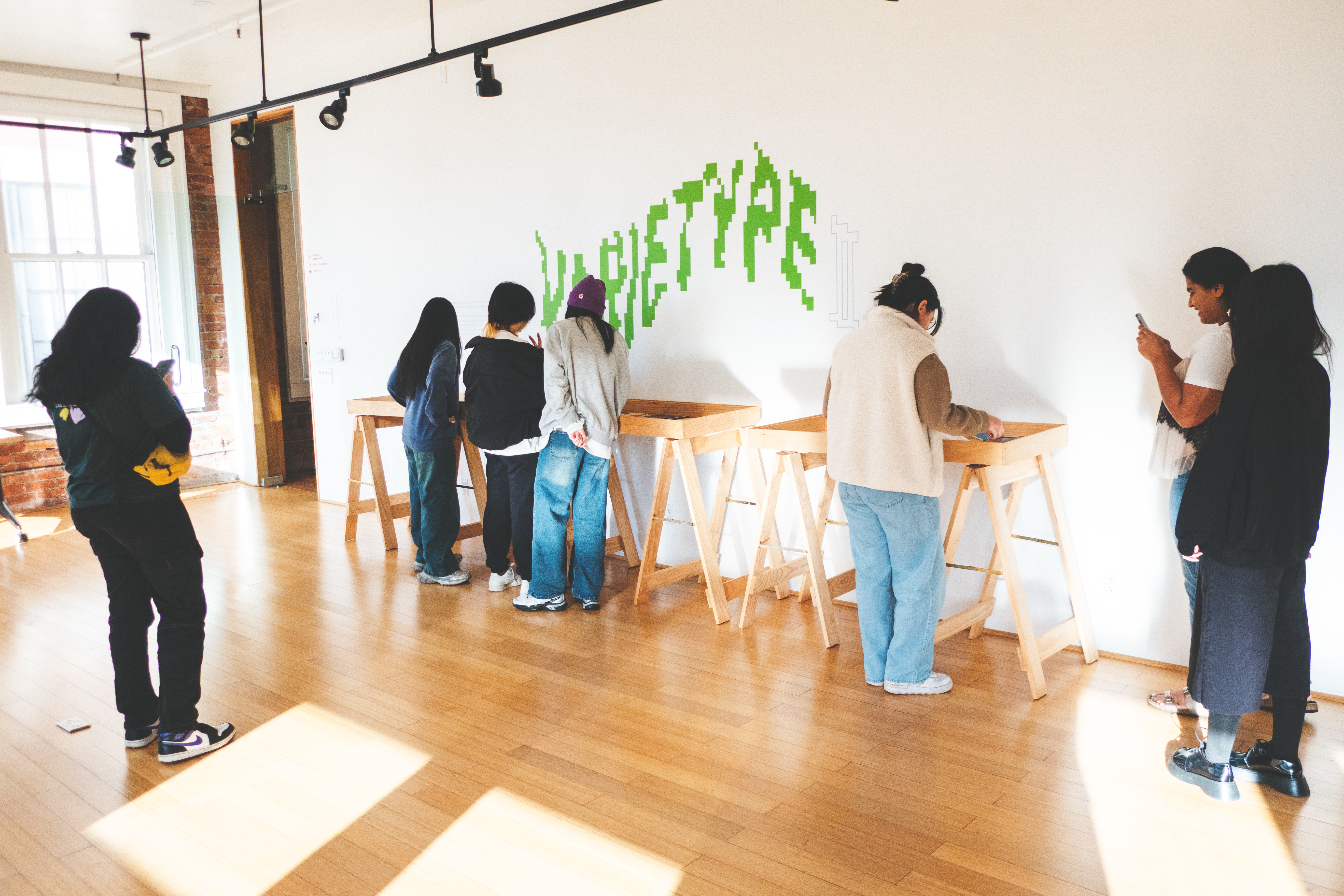
varietype II
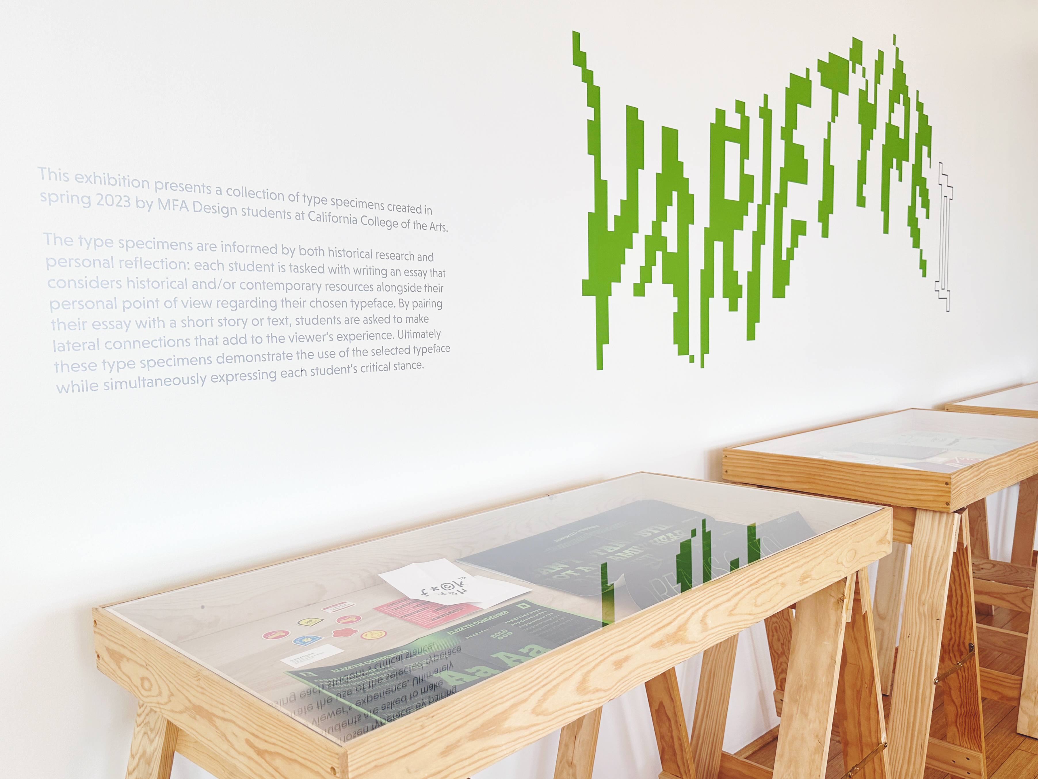
feb 22 - mar 21, 2024 at letterform archiveco-curation of varietype II, an exhibition presenting a collection of type specimens created in spring 2023 by mfa design students at the california college of the arts. the initial curator, ana llorente, went on a teaching break beginning of 2024 so she passed all curation duties to me.
exhibition curation
exhibition design
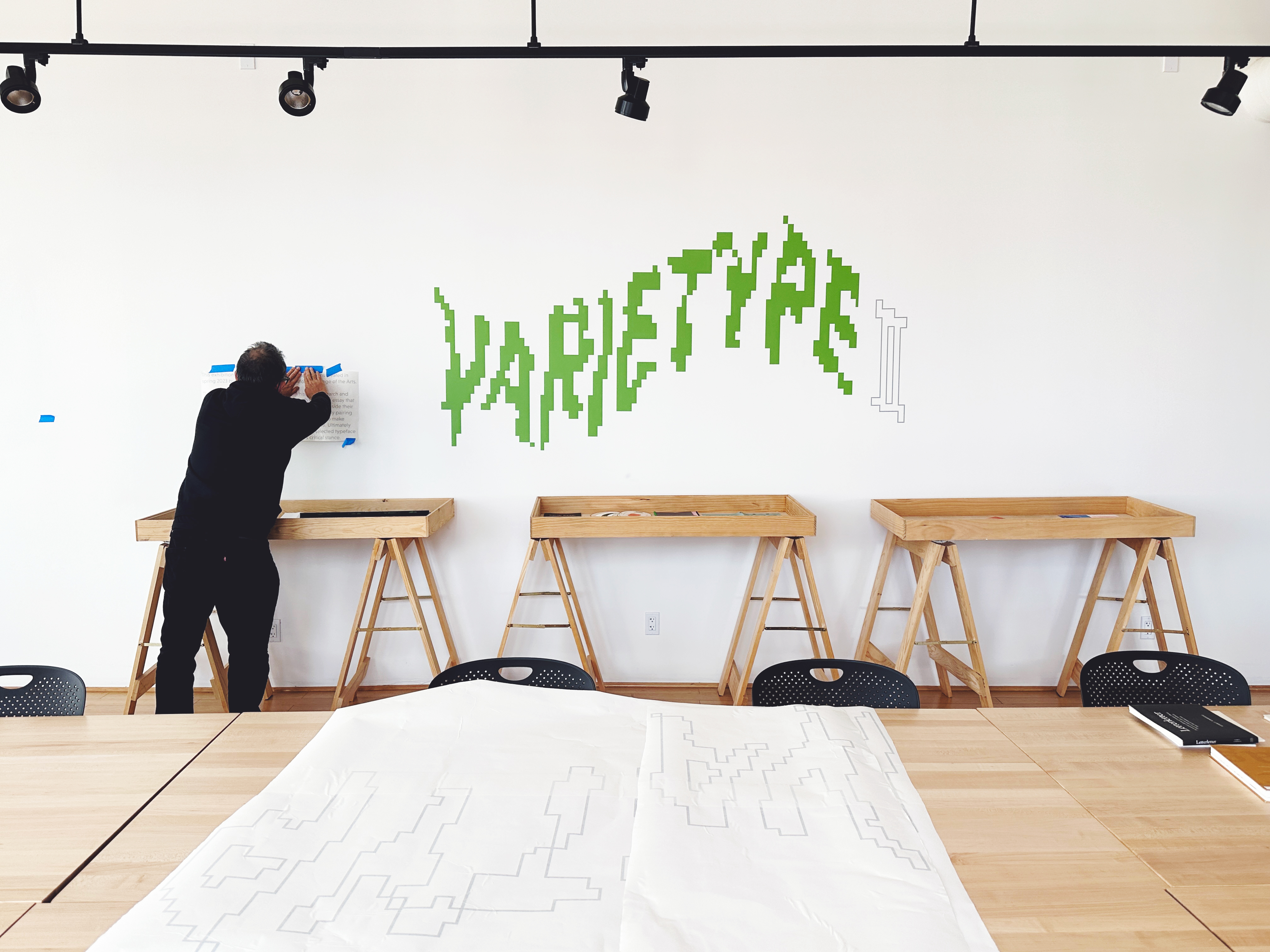
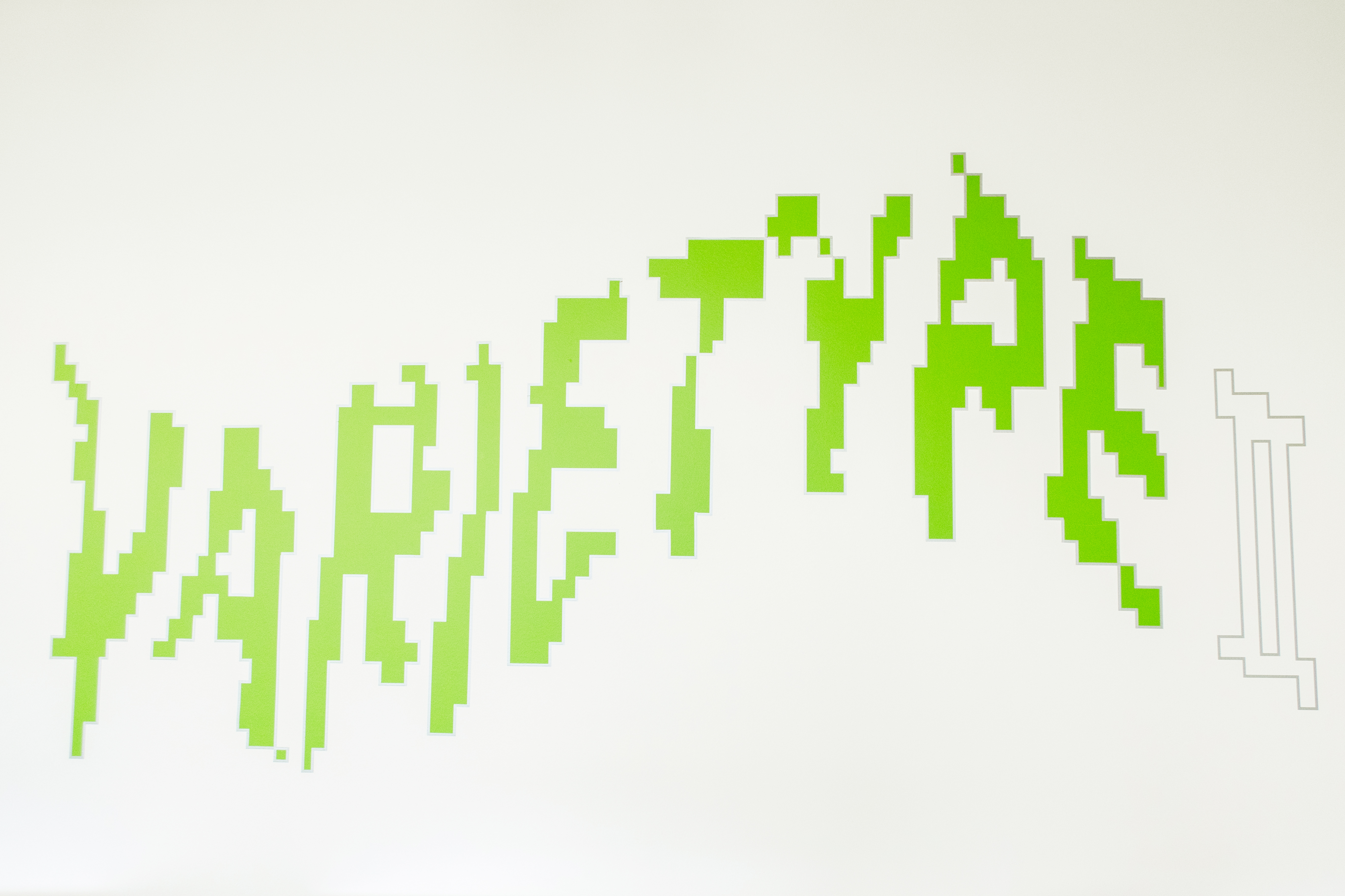
exhibition installation
branding
identity system
risograph printing
digital assets
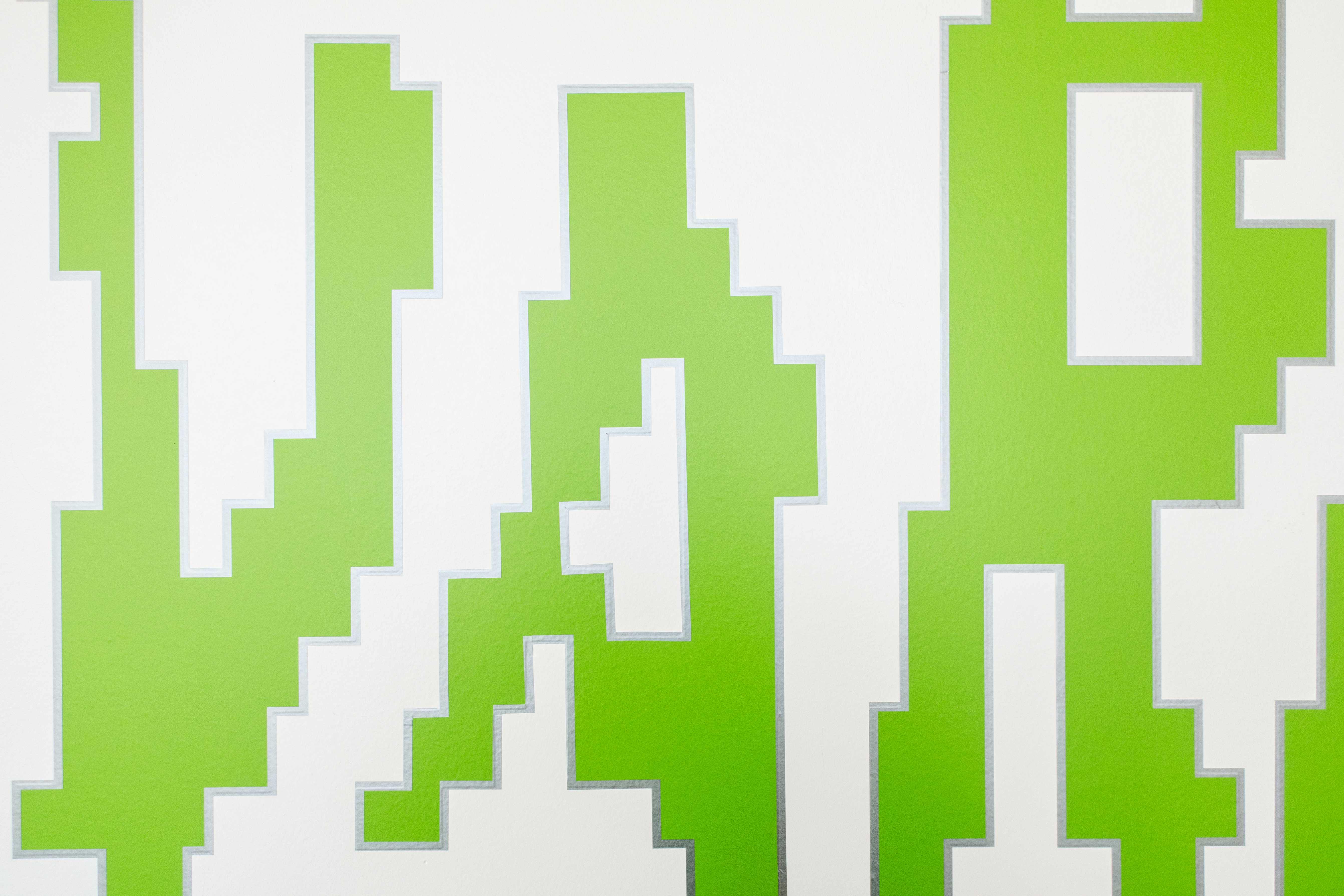
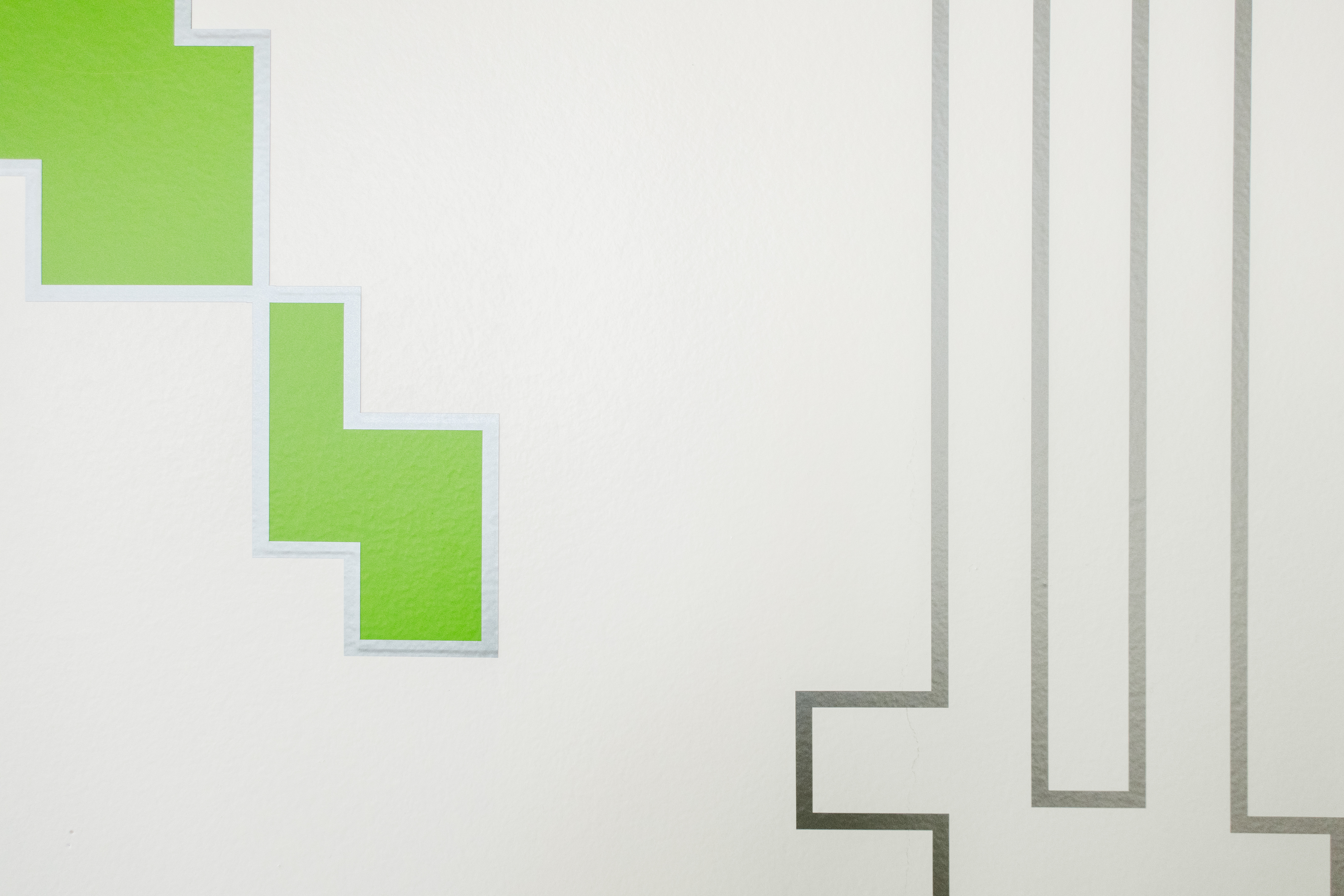
vinyl work
exhibition curation
exhibition design
exhibition installation
branding
identity system
risograph printing
digital assets
vinyl work
about the exhibition
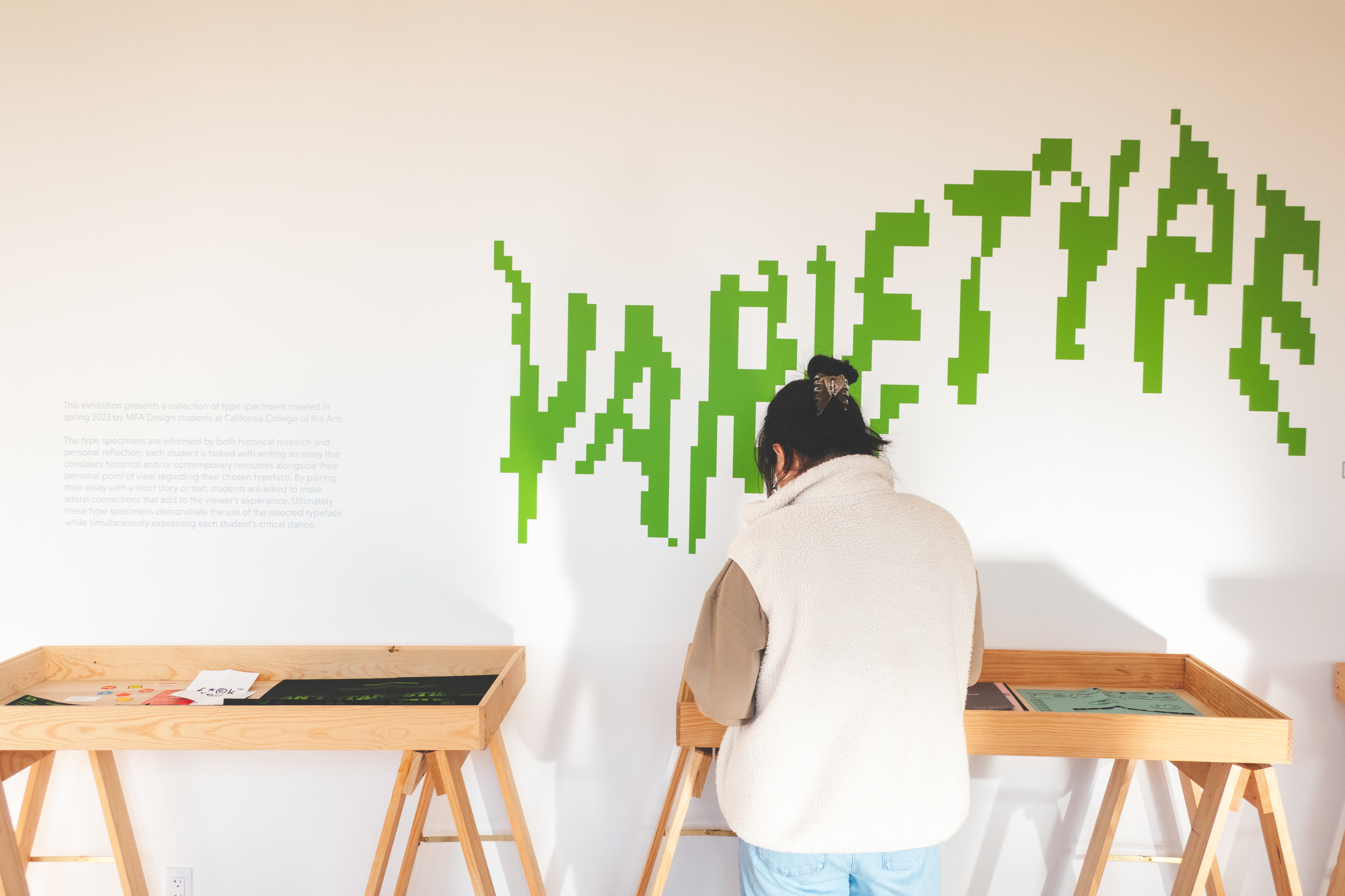
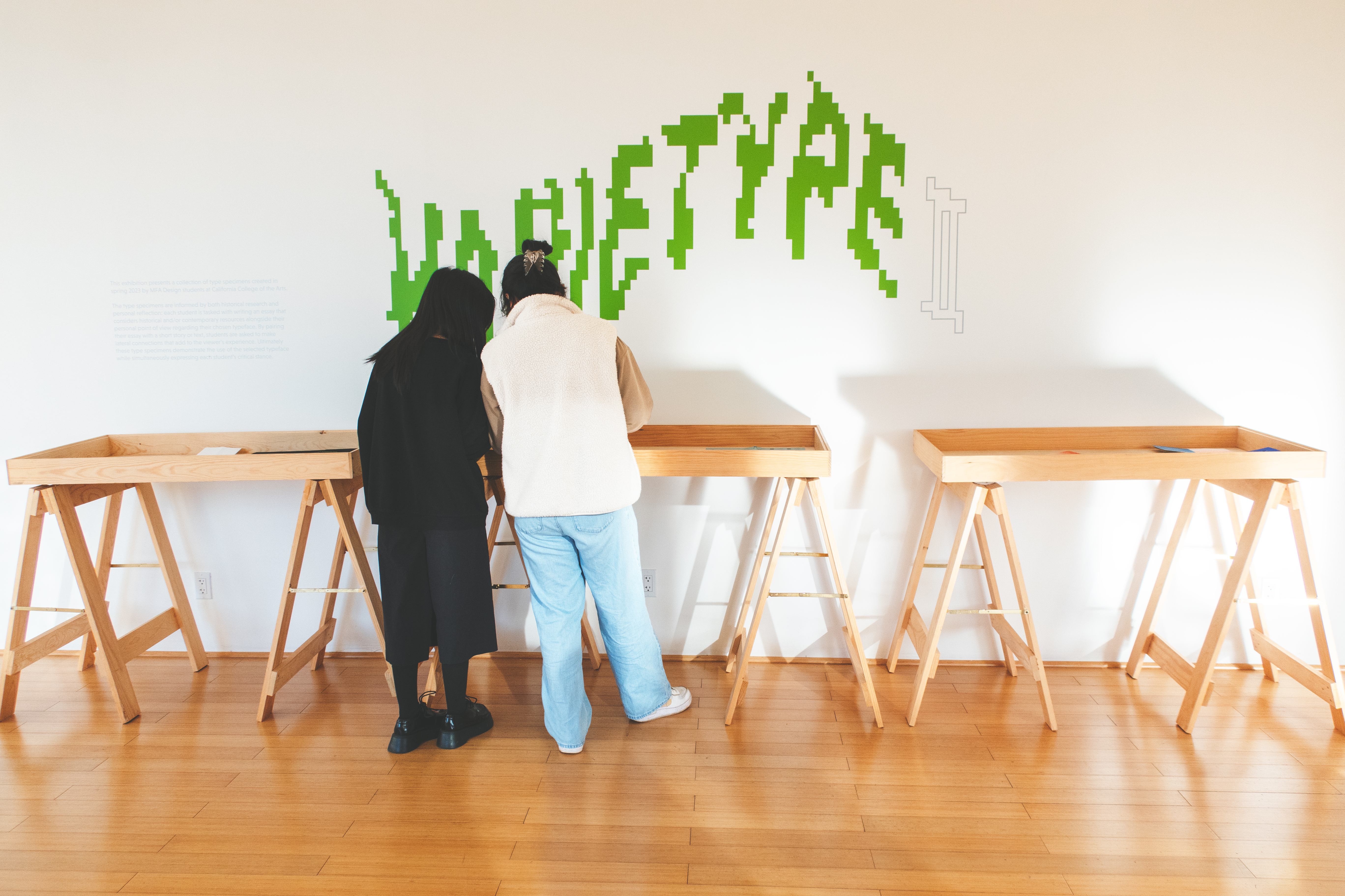
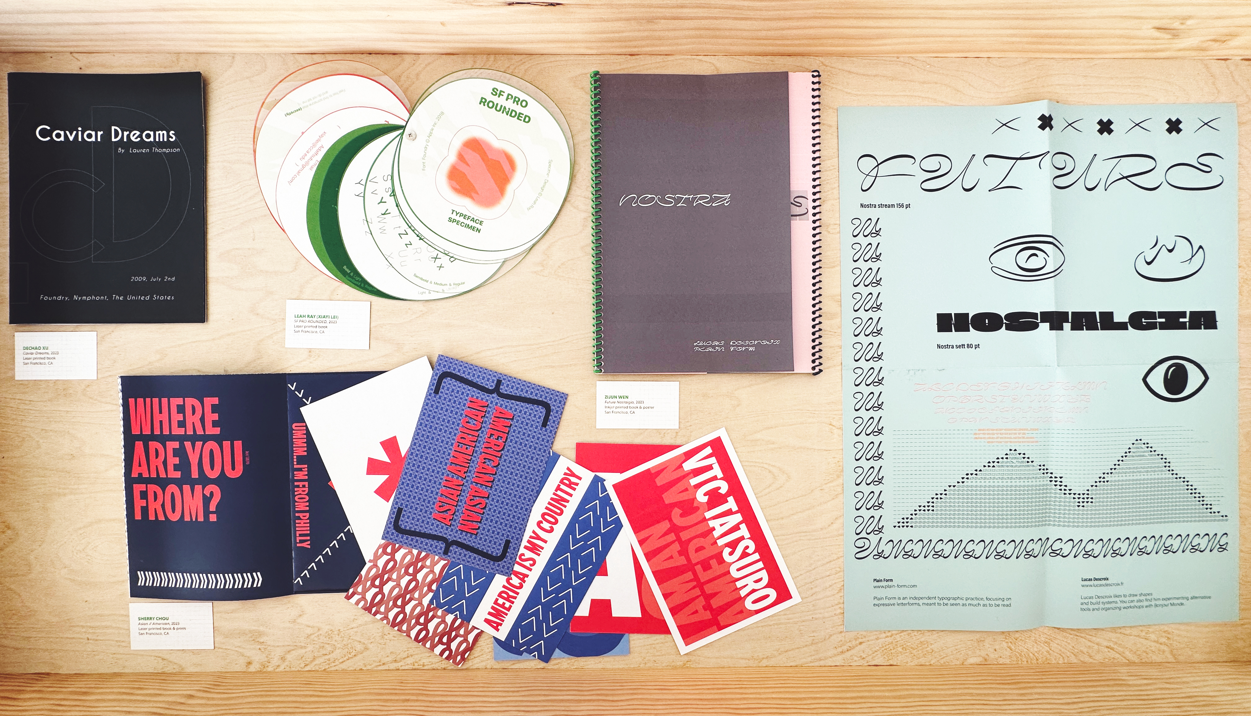
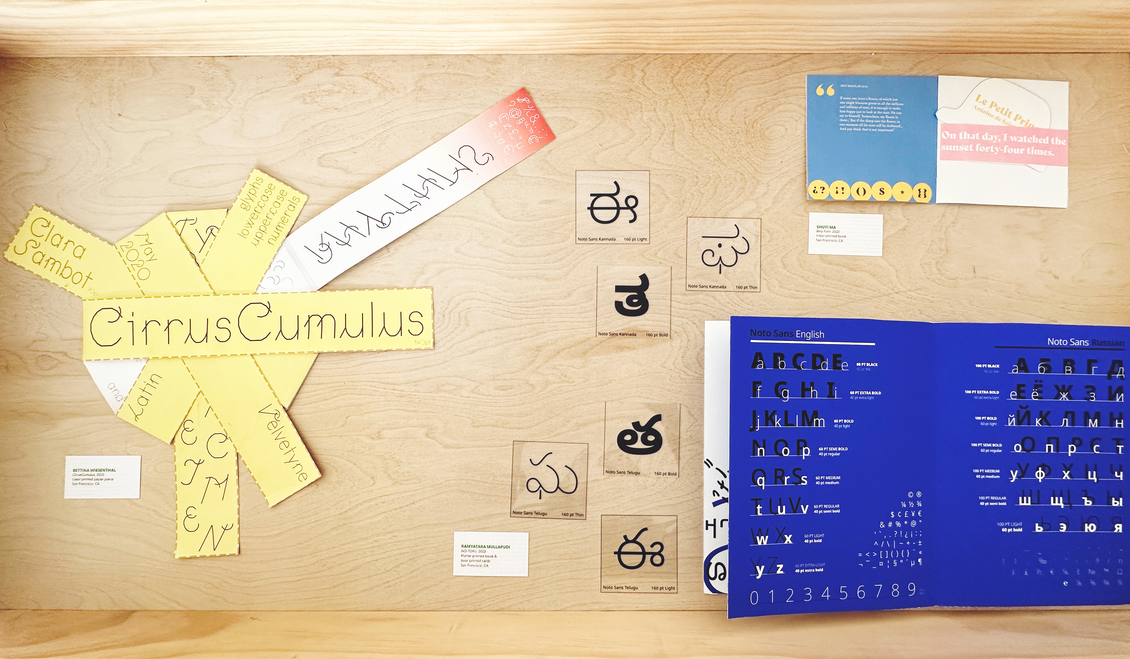
“the type specimens are informed by both historical research and personal reflection: each student is tasked with writing an essay that considers historical and/or contemporary resources alongside their personal point of view regarding their chosen typeface. by pairing their essay with a short story or text, students are asked to make lateral connections that add to the viewer’s experience. ultimately these type specimens demonstrate the use of the selected typeface while simultaneously expressing each student’s critical stance.” - ana llorente

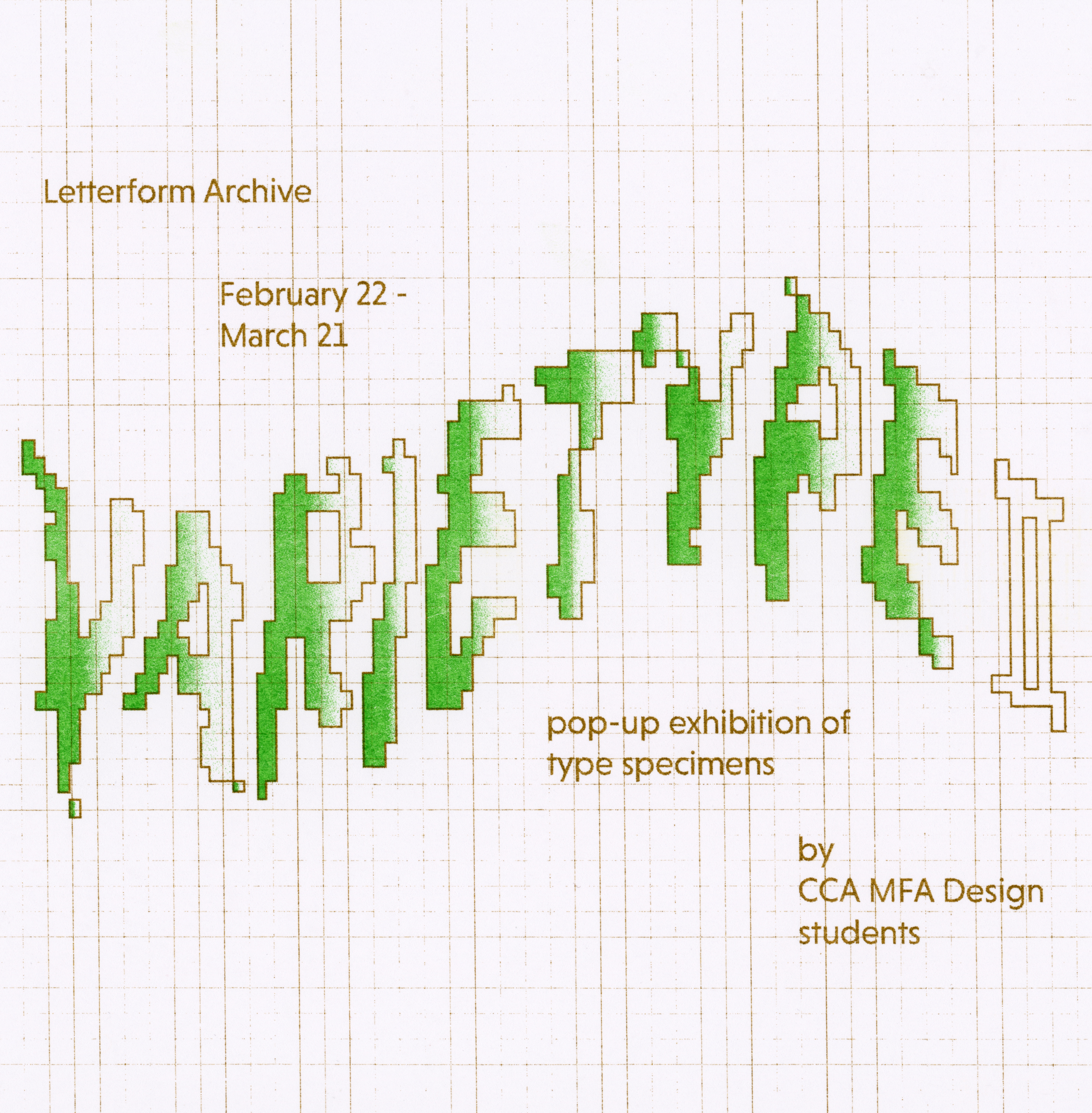
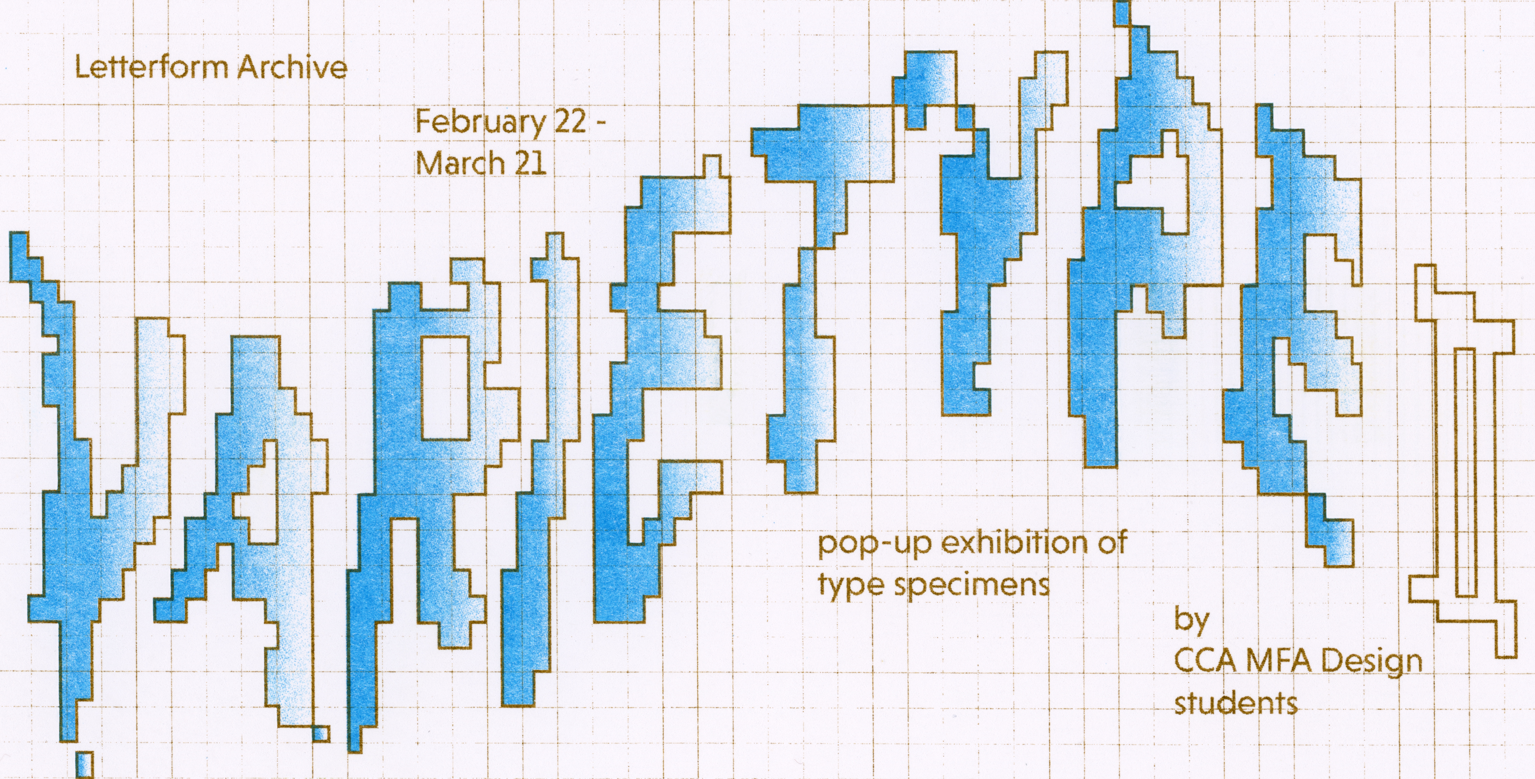
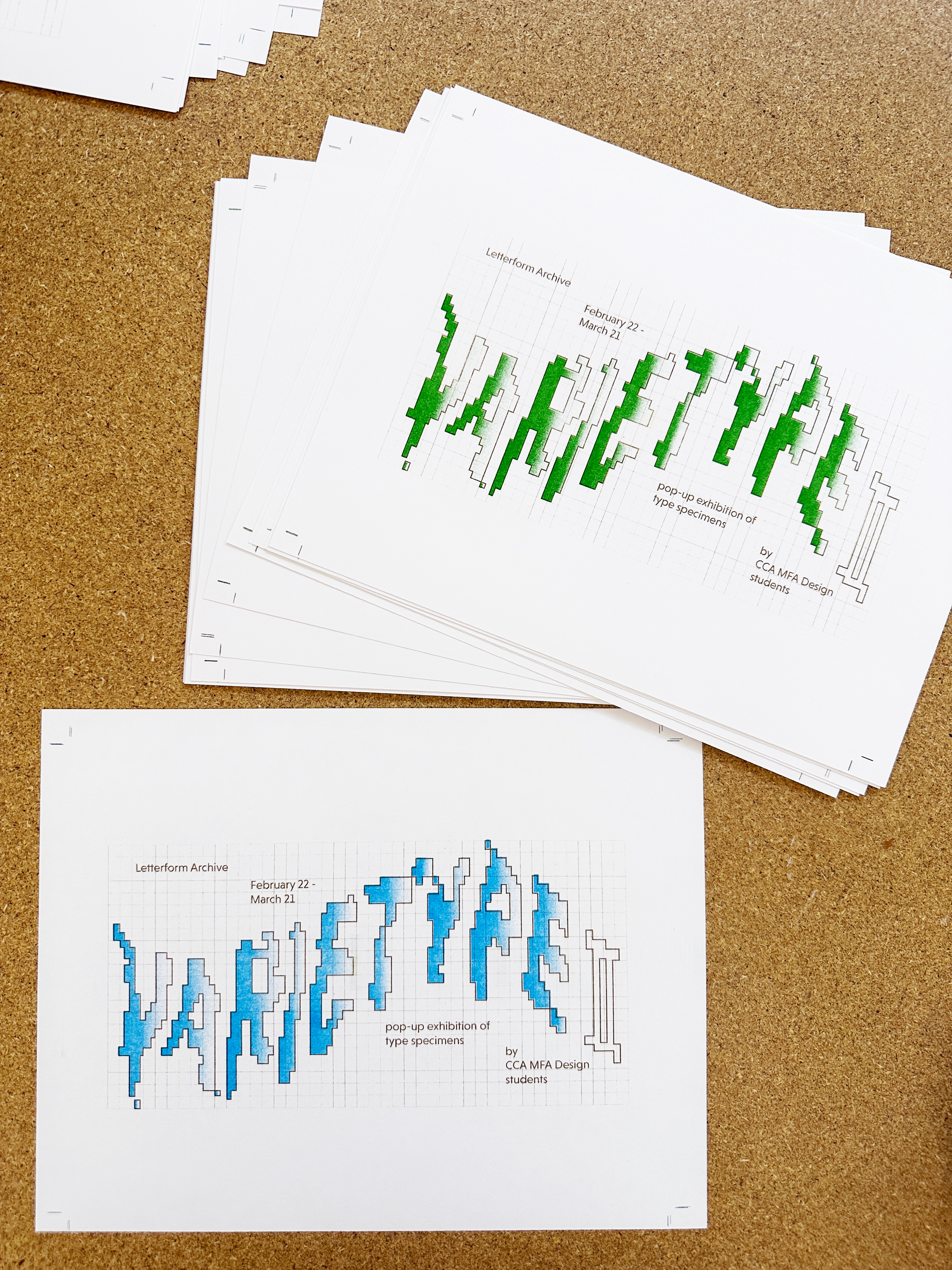
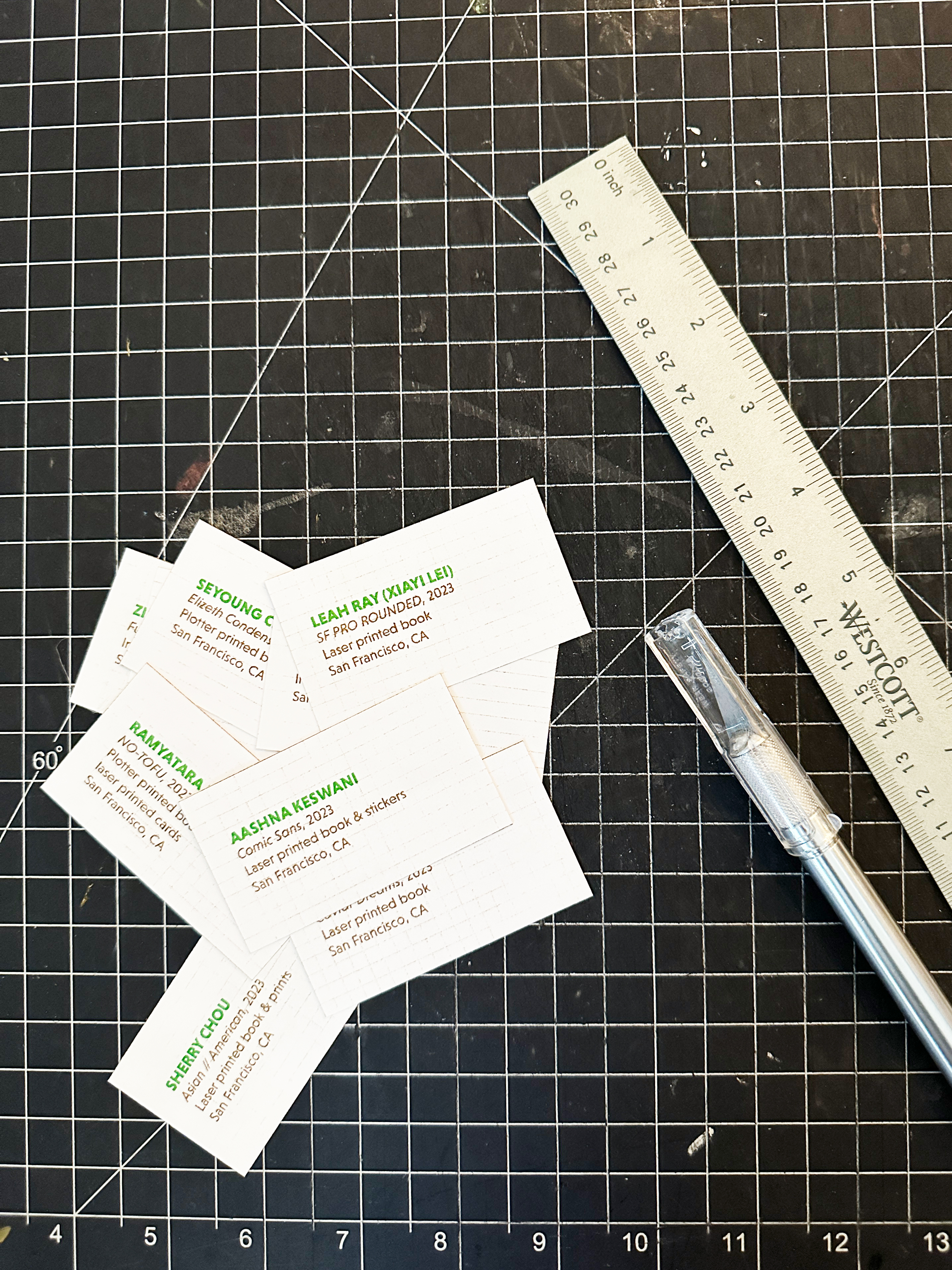
digital + physical assets
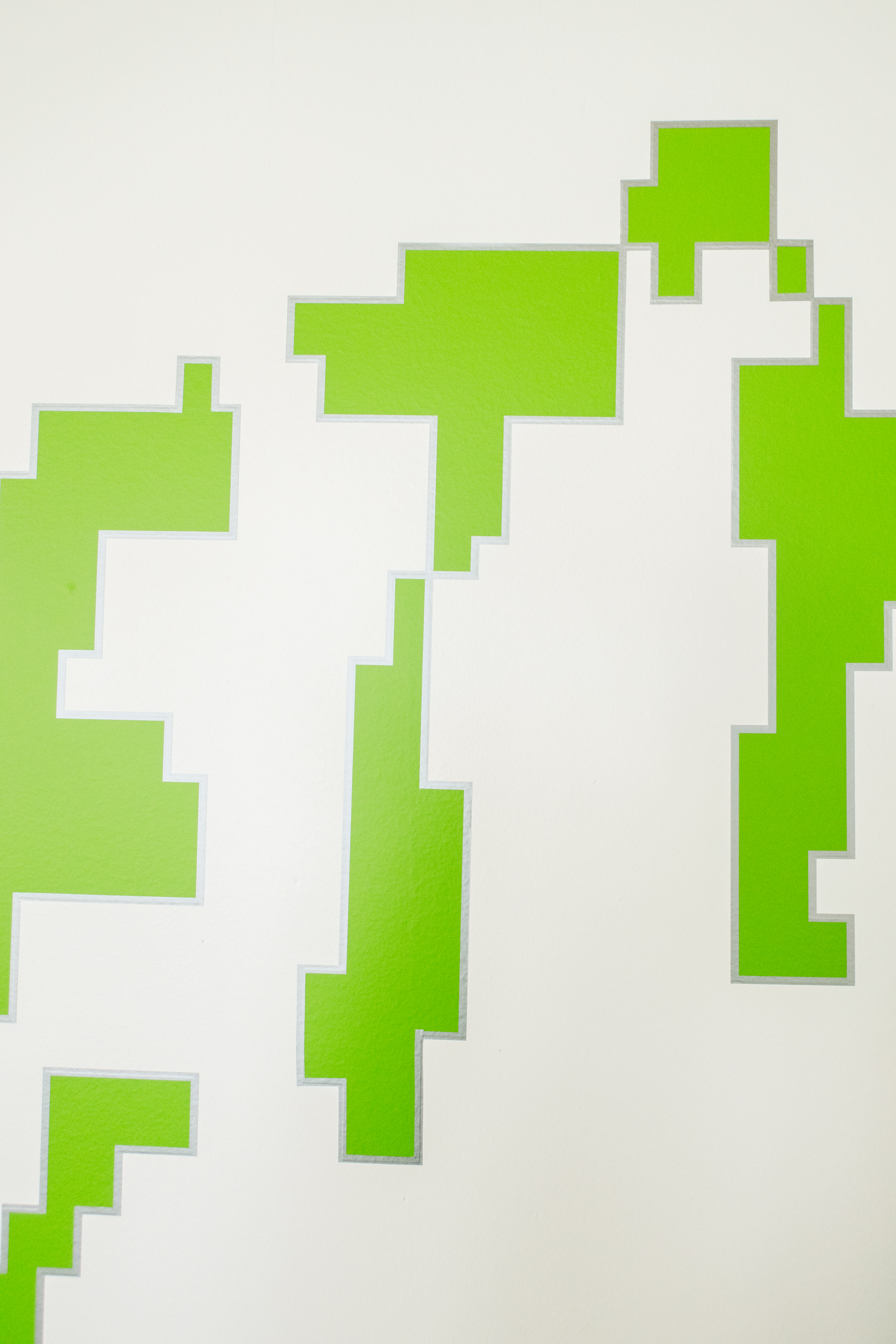
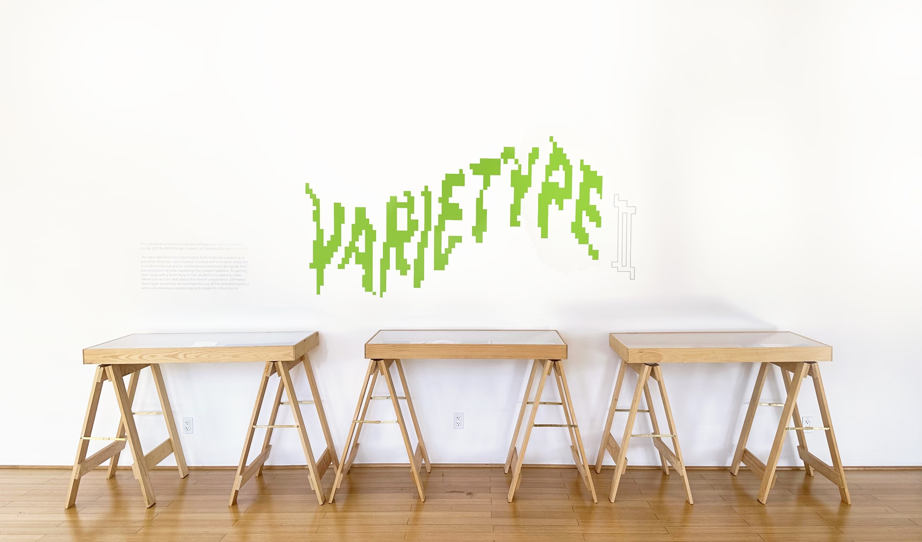
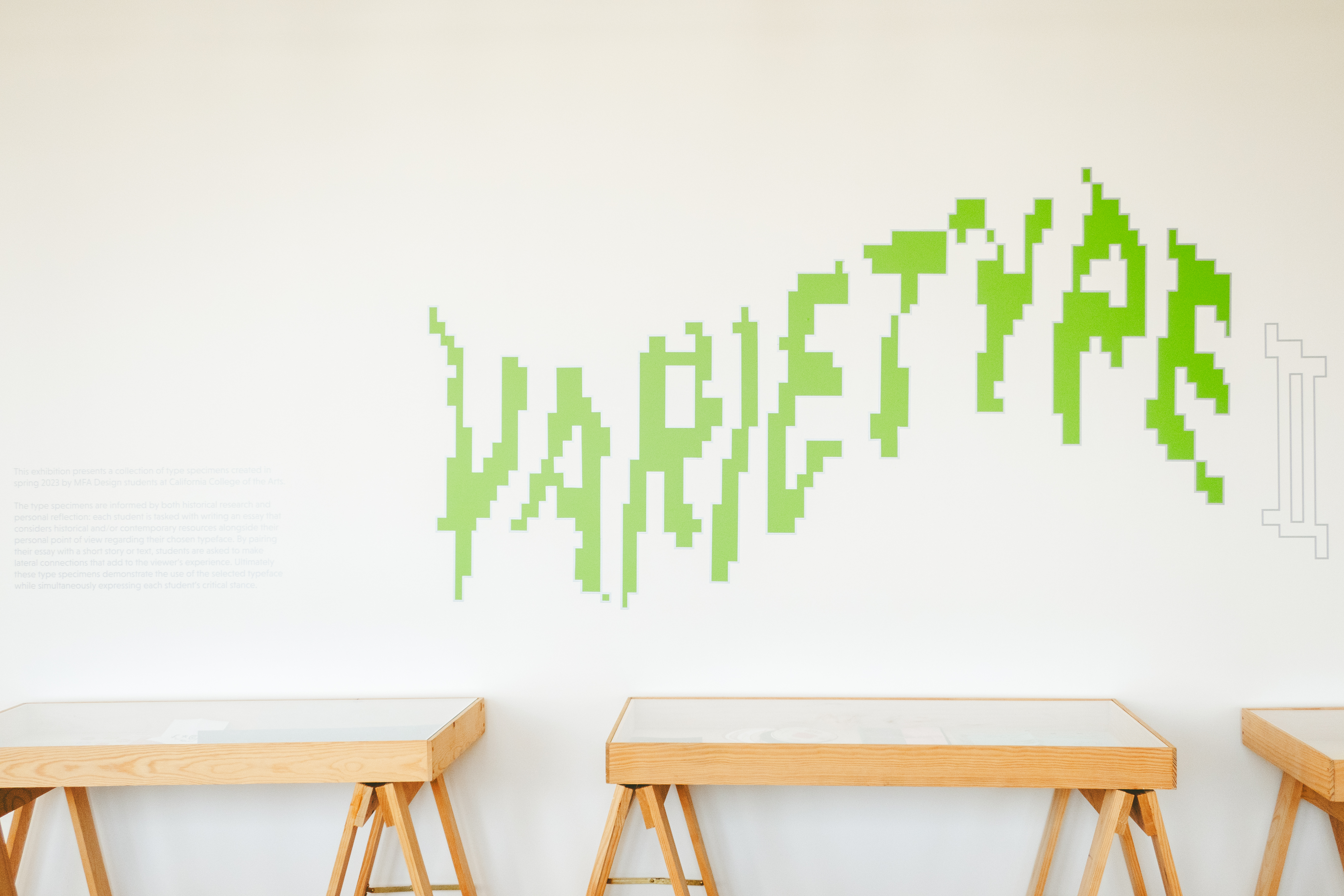
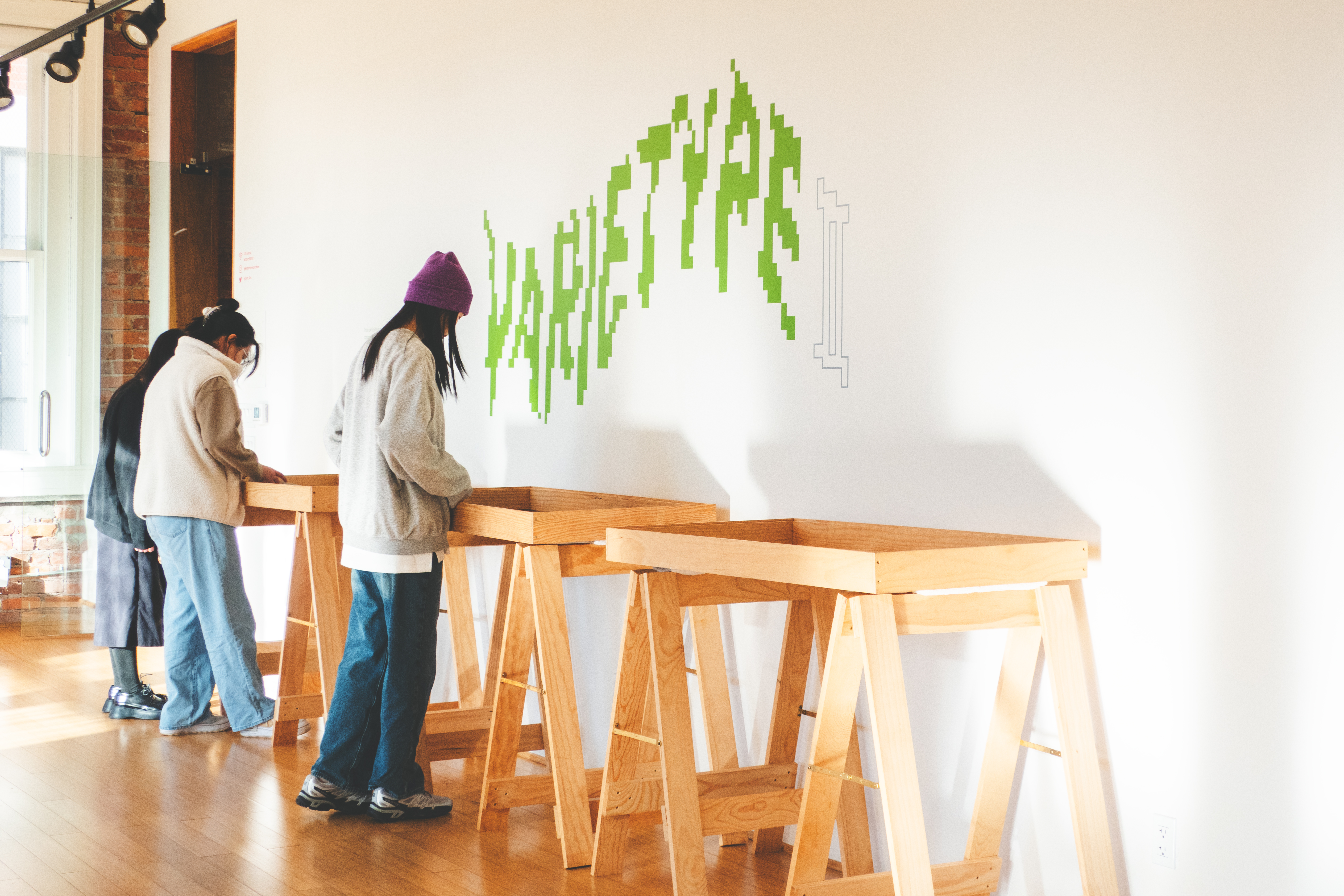
digital assets include a show banner and instagram post; physical asset include title cards. all digital assets were done in collaboration with another classmate, leah ray (xiayi lei). figma was used to consolidate ideas and post design iterations. the risograph was chosen as the main production method, used to soften the hardness of the custom pixelated type. since the show runs into the spring months, we wanted the identity to reflect that transition through the softening and the color usage but still indicate the digital landscape in which the typefaces live.
the title cards were also printed using the same risograph colors to keep the aesthetic consistent between the digital and the physical assets.
the title cards were also printed using the same risograph colors to keep the aesthetic consistent between the digital and the physical assets.

exhibition layout


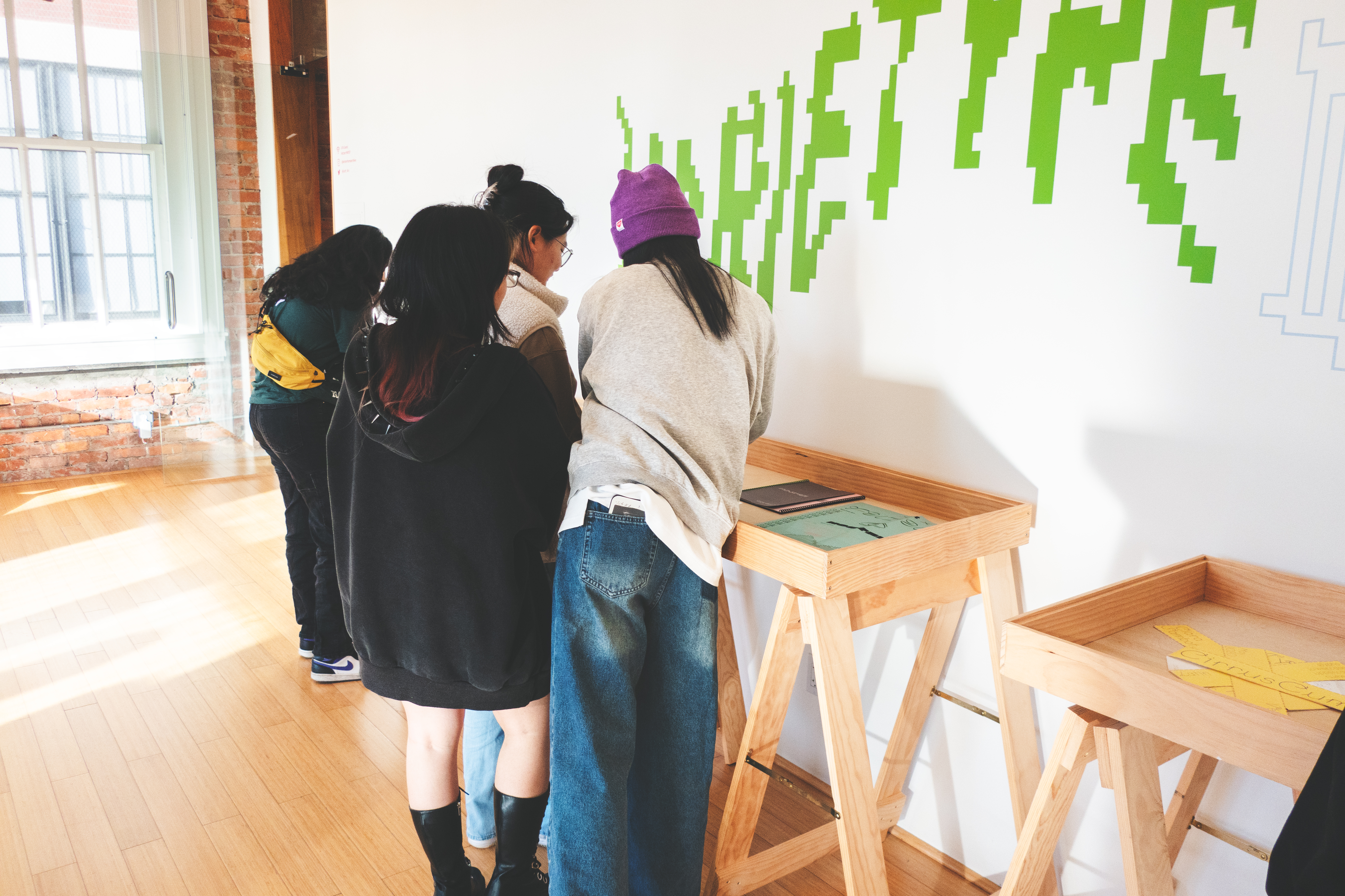
vinyl installation